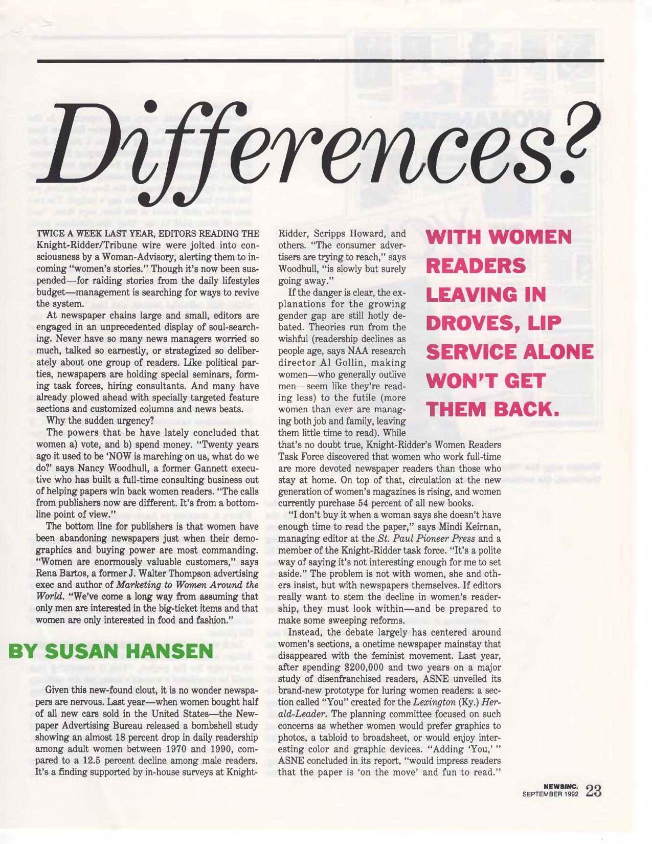
NewsInc. September 1992 article spread headlined "Differences?" examining why women were leaving newspapers

Looking at the Newspaper Gender Gap,1992

An article by Susan Hansen in the September 1992 issue of NewsInc., examining why women were leaving newspapers and what editors were — and weren’t — doing about it. The piece opens with the Knight-Ridder/Tribune wire’s short-lived “Woman-Advisory” alerts and moves through the task forces, consultants, seminars and targeted sections that chains large and small had launched, driven less by principle than by economics.

The powers that be have lately concluded that women a) vote, and b) spend money.

The numbers cited: a Newspaper Advertising Bureau study showing an almost 18 percent drop in daily readership among adult women between 1970 and 1990, compared with a 12.5 percent decline among male readers; women holding only 10 percent of editor and executive editor slots at papers with circulations of more than 250,000, per the National Federation of Press Women; and a Women, Men, and Media Project survey of 20 front pages in February 1992 that found women claimed just 34 percent of bylines and only 13 percent of those referenced or quoted.

Quoted throughout are consultant and former Gannett executive Nancy Woodhull, St. Paul Pioneer Press managing editor Mindi Keirnan, Los Angeles Times associate editor Narda Zacchino, Washington Post columnist Judy Mann, Knight-Ridder vice president for news Jennie Buckner, and Georgetown linguist Deborah Tannen. Keirnan on the “no time to read” explanation:

“I don’t buy it when a woman says she doesn’t have enough time to read the paper… It’s a polite way of saying it’s not interesting enough for me to set aside.”

Much of the industry’s response, the article reports, centered on reviving women’s sections — ASNE‘s $200,000 “You” prototype for the Lexington (Ky.) Herald-Leader, and the Chicago Tribune‘s “Womanews,” which about 60 newspapers signed on to syndicate in its first year. Critics warned of ghettoizing serious coverage. Zacchino:

“I find women saying we need to do more in the rest of the paper. We should start on the front page—make women feel this entire newspaper has something of interest to them.”

A companion feature, “Advice and Dissent,” gave 10 newswomen free rein to critique the front pages of The New York Times and the Los Angeles Times. The panel: Deborah Howell of Newhouse News Service; Jacqui Banaszynski of the St. Paul Pioneer Press; Amy Kisman of USA Weekend; Nina Bernstein of New York Newsday; Emilia Askari of the Detroit Free Press; Renée Loth of the Boston Globe; columnists Judy Mann, Robin Abcarian of the L.A. Times and Betty Bayé of the Louisville Courier-Journal; and graphics director Laura Varon Brown of the Detroit Free Press. Their consensus was to focus on real people, replace foreign roundups with enterprise, and give women a presence.

“The truth about why women are leaving newspapers is self-evident,” says Washington Post columnist Judy Mann. “I don’t exist on these front pages.”

The article closes with examples of papers changing beats rather than adding sections — a full-time day care reporter and family page at the Charlotte Observer, expanded women’s sports and personal finance coverage at the Rocky Mountain News, and at the St. Paul Pioneer Press, reduced local political coverage, doubled education staffing, a new women’s health care reporter, and new consumer and local transportation beats. Keirnan on what convinced her staff, after she made line editors and reporters interview women readers and nonreaders directly:

“When people say to you ‘I read the paper while I blow dry my hair,’ you get religion.”

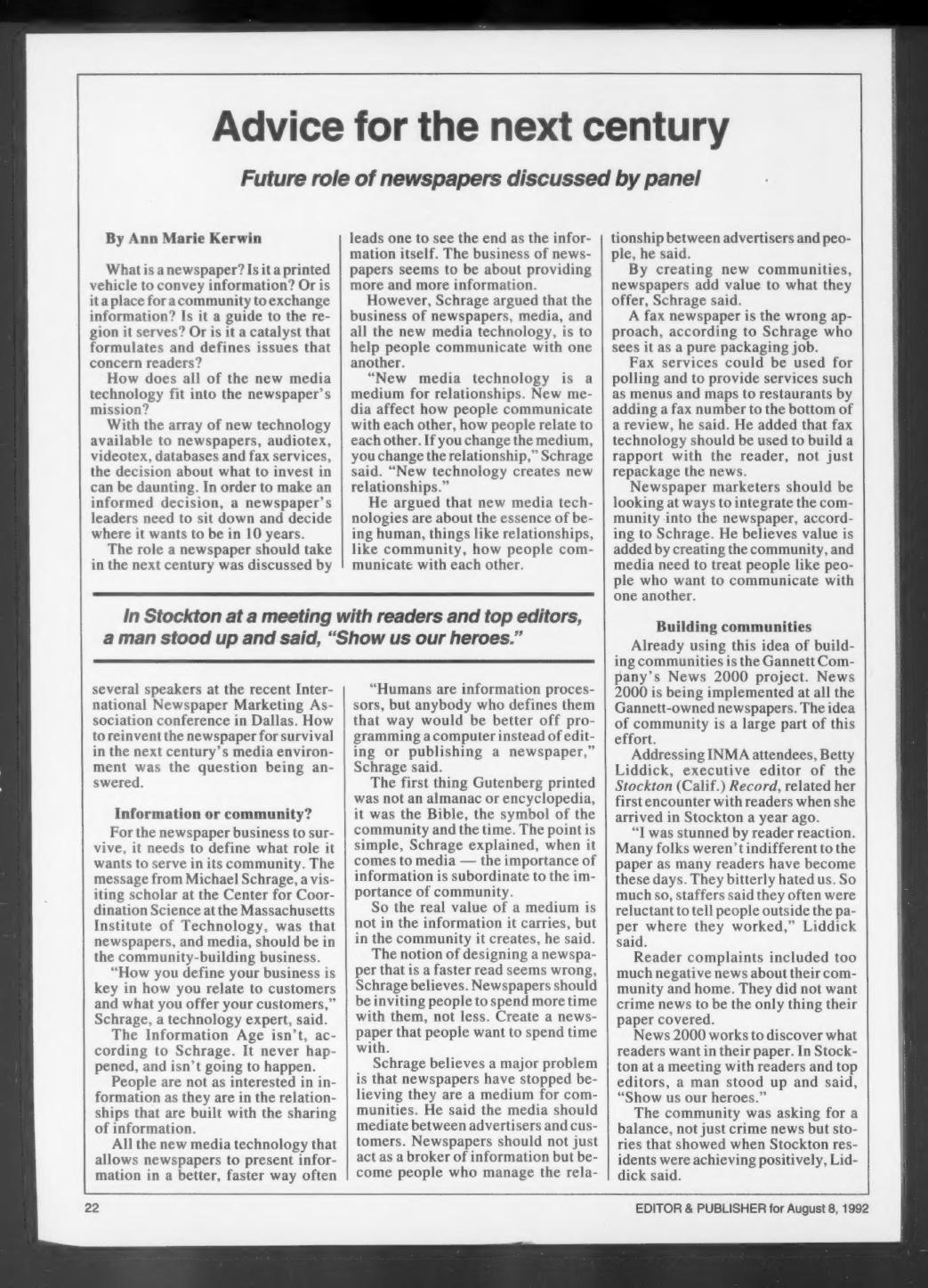
Editor & Publisher clipping from August 1992 covering an INMA conference panel on how to reinvent the newspaper for the next century

Advice for Next Century: An INMA Panel on the Future

An Editor & Publisher story by Ann Marie Kerwin, published August 8, 1992, reporting on a session at the International Newspaper Marketing Association conference in Dallas. The question on the table: how to reinvent the newspaper for survival in the next century’s media environment, at a moment when audiotex, videotex, databases and fax services were all competing for newspaper investment dollars.

The main speaker was Michael Schrage, a visiting scholar at the Center for Coordination Science at the Massachusetts Institute of Technology, who argued that newspapers and media should be in the community-building business rather than the information business.

“New media technology is a medium for relationships. New media affect how people communicate with each other, how people relate to each other. If you change the medium, you change the relationship. … New technology creates new relationships.”

Schrage said the Information Age never happened and isn’t going to happen, that the real value of a medium is not in the information it carries but in the community it creates, and that designing a newspaper for a faster read is the wrong goal — papers should invite readers to spend more time with them. He dismissed the fax newspaper as “a pure packaging job,” suggesting instead that fax be used for polling or for services like menus and maps tied to a restaurant review.

“Humans are information processors, but anybody who defines them that way would be better off programming a computer instead of editing or publishing a newspaper.”

The second half of the story covers the Gannett Company’s News 2000 project, then being implemented at all Gannett-owned papers, with community at the center of the effort. Betty Liddick, executive editor of the Stockton (Calif.) Record, described arriving in Stockton a year earlier:

“I was stunned by reader reaction. Many folks weren’t indifferent to the paper as many readers have become these days. They bitterly hated us. So much so, staffers said they often were reluctant to tell people outside the paper where they worked.”

Readers complained of too much negative news about their community and home, and didn’t want crime news to be the only thing the paper covered. At a meeting with readers and top editors, one man stood up and said, “Show us our heroes.”

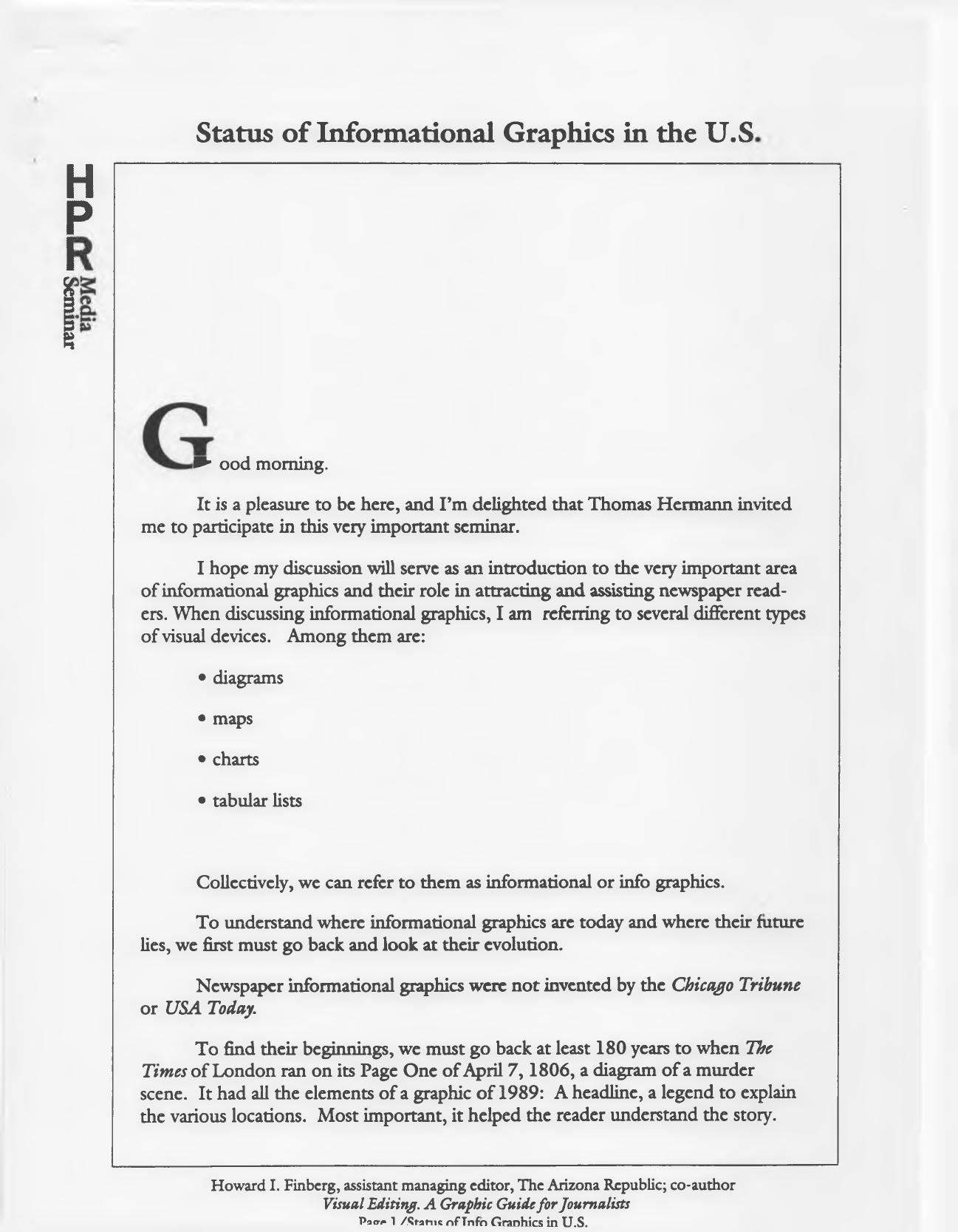
Pages of an early-1990s seminar handout on the status of informational graphics in U.S. newspapers, drawn from the textbook Visual Editing

Status of Informational Graphics in the U.S.: A Swiss Seminar Handout

In the early 1990s I presented a seminar in Switzerland. Sadly, I don’t remember exactly when or where — which is why this file is going into the Archive section until more information turns up. The handout given to seminar participants also served as my speech. It draws on my then-newly published textbook, Visual Editing: A Graphic Guide for Journalists (1990). The document credits Thomas Hermann with the invitation.

The talk traces the evolution of informational graphics — diagrams, maps, charts and tabular lists — from a murder-scene diagram on Page One of The Times of London on April 7, 1806, through William Playfair’s 1786 The Commercial and Political Atlas, to war maps of World Wars I and II, the space program, and the arrival of USA Today on Sept. 15, 1982. Along the way it notes that the Chicago Tribune created a graphics editor position in 1974, one of the country’s first full-time visual journalists.

One of my favorite quotations, from the Austrian statistician Otto Neurath in 1925, appears early in the text:

“Words divide, pictures unite…to remember simplified pictures is better than to forget accurate figures.”

The handout also reports survey findings from more than 350 members of the American Society of Newspaper Editors, done in connection with the American Press Institute’s 1988 J. Montgomery Curtis seminar: 92 percent expected to use more informational graphics within five years, and 90 percent said graphics would play a greater role in their newspapers in the year 2000.

And a warning that still holds up:

When we run misleading graphics because of a lack of data points or “empty graphics” that are merely type-breakers, we communicate very little and take up precious news space.

The remainder of the handout is drawn from the textbook: chapters on how a graphics editor works — gathering and editing information, request forms, working with artists, fact checking — and a section on choosing the right device, with examples from The Arizona Republic illustrating tables and lists, line/fever charts, pie charts, pictograms, map graphics, and vertical and horizontal bar charts.

Cover of the Newspaper Advertising Bureau's October 1987 report summarizing the 1987 Newspaper Inventory Survey of U.S. daily newspapers

Daily Newspapers ’87: Taking Stock

An October 1987 report from the Newspaper Advertising Bureau summarizes the findings of NAB’s 1987 Newspaper Inventory Survey — a mail survey of every daily and Sunday/weekend newspaper in the United States and Canada, and the fifth in a series that began in 1967 and continued in 1974, 1979 and 1983. This volume covers local, English-language weekday editions in the U.S. only; a companion volume handled Sunday and weekend editions.

The survey’s original purpose was commercial: give advertisers and agencies a way to find newspapers carrying particular standing features, so an ad could be positioned next to the right kind of content. Later editions added questions about content, graphics and layout, positioning practices, ROP color, zoning, split runs and home delivery. The 1987 weekday inventory counted twelve kinds of sections and fifty-eight kinds of features or columns. (Pretty quaint given how ads are placed today.)

The base for the tables:

The summary tables shown are based on completed questionnaires from 987 daily newspapers representing 59% of all United States dailies and 79% of total circulation.

On content, the report found the churn of the early 1980s hadn’t slowed:

Findings from the 1987 Newspaper Inventory show that the period of rapid change in content, previously noted in the 1979 and 1983 inventories, continues unabated. Since 1983, nearly seven out of ten newspapers (69%) report substantial changes in content.

The most frequently reported changes were increased business coverage (53% of newspapers), increased sports coverage (45%), and a shift in the ratio of state and local to national and international coverage (35%).

The design numbers are the ones I keep coming back to. Eighty-two percent of newspapers — 91% of circulation — reported substantial changes in graphics or layout since 1983. More use of ROP color (61%) and conversion to Standard Advertising Units (SAU) page and column specs (60%) led the list, followed by changed mastheads, changed typefaces, more photographs, and modular front pages. And then this:

There has also been a substantial increase in use of computer graphics. In the 1987 study, 28% of responding dailies (52% of circulation) reported more use of graphics compared to 2% in 1983 (3% of circulation).

The feature tables are a time capsule. Crossword puzzles appeared in 98% of weekday circulation, spectator sports 94%, astrology 92%, TV log 92%, business and finance 89%, weather map 89%. Ninety-five percent of responding papers carried comic strips, and the typical weekday edition had three physically separate sections. Zoning was reported by 30% of dailies but 59% of circulation. The median share of weekday circulation that was home delivered: 85%.

The study was directed by Charles Lehman of NAB’s Research Department, and the report was updated by Dorothy Shea. A computerized list of editions carrying any particular section or feature was available on request — by telephone.

Reading this in 2026, what stands out isn’t just how many of these features have vanished from print (the TV log, the movie timetable, the radio log, the stock tables) but that the inventory itself was a product for advertisers — a printed, mailed, hand-tabulated database of what newspapers contained. That function moved online long ago, along with the advertising it was built to serve. The Newspaper Advertising Bureau no longer exists as a separate organization; its work eventually merged into the industry association that became the Newspaper Association of America.

Cover of Design No. 1, March 1980, the Society of Newspaper Designers journal containing the "What is a graphics editor?" talk

“What Is a Graphics Editor?” — The First Issue of Design, March 1980

This is No. 1 of Design, the quarterly journal of the Society of Newspaper Designers, dated March 1, 1980 and edited by Richard Curtis, then assistant managing editor of The News American in Baltimore. The 32-page issue includes Louis Silverstein of The New York Times on design and content, Robert Lockwood’s essay on newspaper management by design, David B. Gray of the Providence Journal-Bulletin on the photo lab as a newsroom resource, Randy Miller’s report on the Kansas City Star/Times seminar, Ed Breen of the Marion (Ind.) Chronicle on words and pictures, a rundown of the Society’s first Newspaper Design Contest, and the redesign of GRIT’s front page.

Curtis used his editor’s note to explain where the organization came from — and how quickly it had grown.

The society was founded, rather informally, in 1978 in a bar in Reston, Virginia during the first American Press Institute seminar on newspaper design.

From a newsletter that went to all 12 members, the Society had reached more than 160 members, produced a videotape presentation called “News by Design,” and mounted its first workshop — held with the Chicago Tribune at the Hyatt Regency in Chicago on Sept. 28, 29 and 30, 1979, drawing nearly 150 participants from the United States, Canada and Costa Rica.

I have a byline in this issue, on a piece headlined “What is a graphics editor?” I didn’t write it. It is a transcription of the talk I gave at that first Chicago workshop, on Sept. 29, 1979, as graphics editor of the Chicago Tribune

My responsibilities at the Tribune are for all graphics that appear in the editorial pages. The question that often arises is, what’s a graphic? The way we define it is charts, maps, combinations… anything that is not what is described as pure illustration. In other words, if it has editorial matter — there are words with it — then it falls under the province of the graphic editor.

Much of the talk was about where the job sits in the newsroom — attending the two daily news meetings, reporting to the assistant managing editor, reading over a reporter’s shoulder before the story lands on the city desk. And about knowing when to say no:

Of course, there’s always one other function of the graphics editor that’s not as pleasant, and that’s knowing when to kill (a graphic). Because there’s nothing worse than a graphic that doesn’t work.

You can have the prettiest looking graphics in the paper and it doesn’t mean anything if it doesn’t communicate with readers.

The issue closes with a membership form ($20 a year, dues covering the magazine), a jobs listing, and a promise for No. 2: an issue built around the question the Kansas City seminar had put to editors — how do we do more with less? Forty-five years on, that’s still the question, and I would go on both to write for this magazine and to be written about in it.

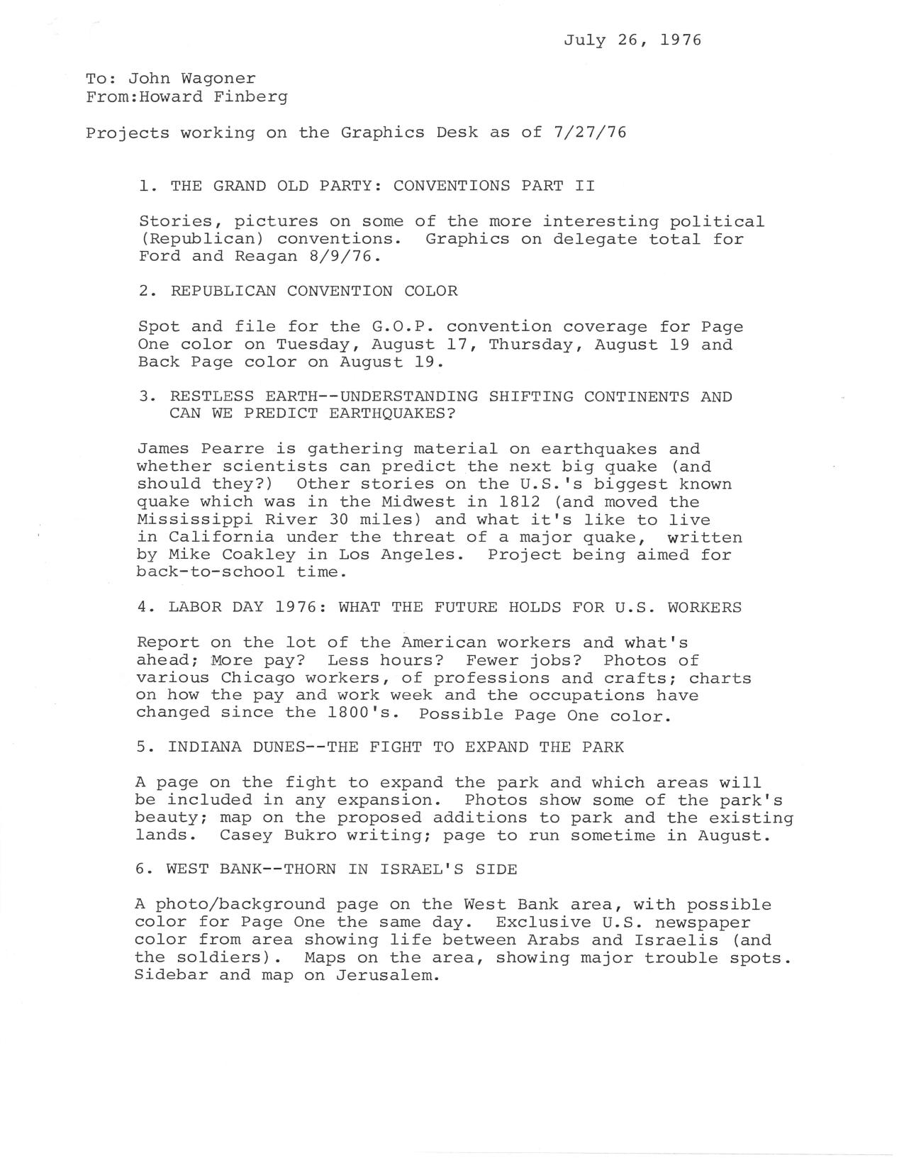
Typed July 1976 memo to Chicago Tribune news editor John Waggoner listing Graphics Desk projects in the works

Projects Working on the Graphics Desk, July 1976

A status memo I sent to John Waggoner, the Chicago Tribune‘s news editor, on July 26, 1976, listing what the Graphics Desk had in the works. It’s a snapshot of how an information graphics operation planned its projects — a mix of hard-news color coverage, explanatory packages, and long-lead background reports.

The list runs from the Republican convention (delegate totals for Ford and Reagan, Page One color on August 17 and 19) to a package on earthquakes aimed at back-to-school time:

Other stories on the U.S.’s biggest known quake which was in the Midwest in 1812 (and moved the Mississippi River 30 miles) and what it’s like to live in California under the threat of a major quake, written by Mike Coakley in Los Angeles.

Also on the schedule: a Labor Day report on American workers, with charts on how pay, the work week and occupations had changed since the 1800s; a page on the fight to expand the Indiana Dunes park, written by Casey Bukro; and a photo/background page on the West Bank, with maps of major trouble spots and a sidebar on Jerusalem.

The “other projects working” section is a reminder of what the mid-1970s looked like from a newsroom. The metric system:

Charts, tables, photos to make it easier on the reader who can’t tell a meter from a liter.

Plus solar energy (Bukro writing), “Weapons of the future” on Black Box technology (Jim Coates in Washington), and space after Viking, with the community turning its sights to the shuttle (Jim Pearre researching).

Copies went to Max McCrohon, Bill Jones, Joe Leonard, Denis Gosselin and Dick Leslie.

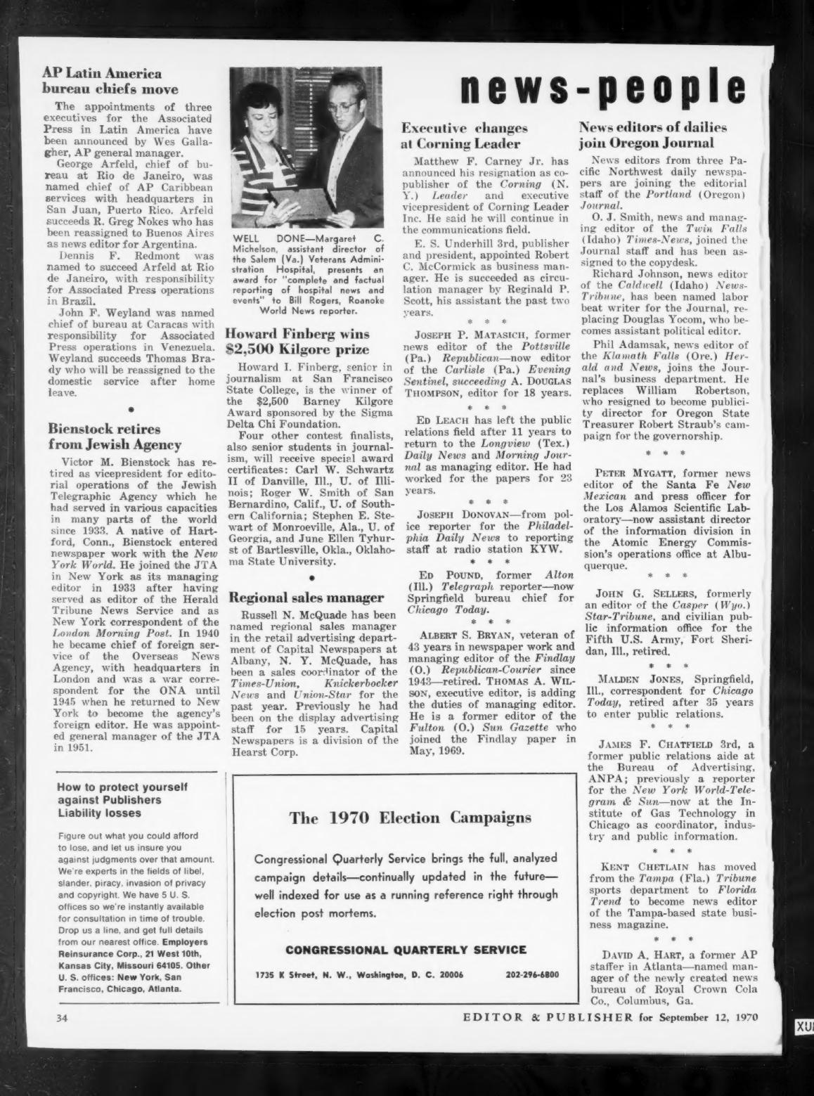
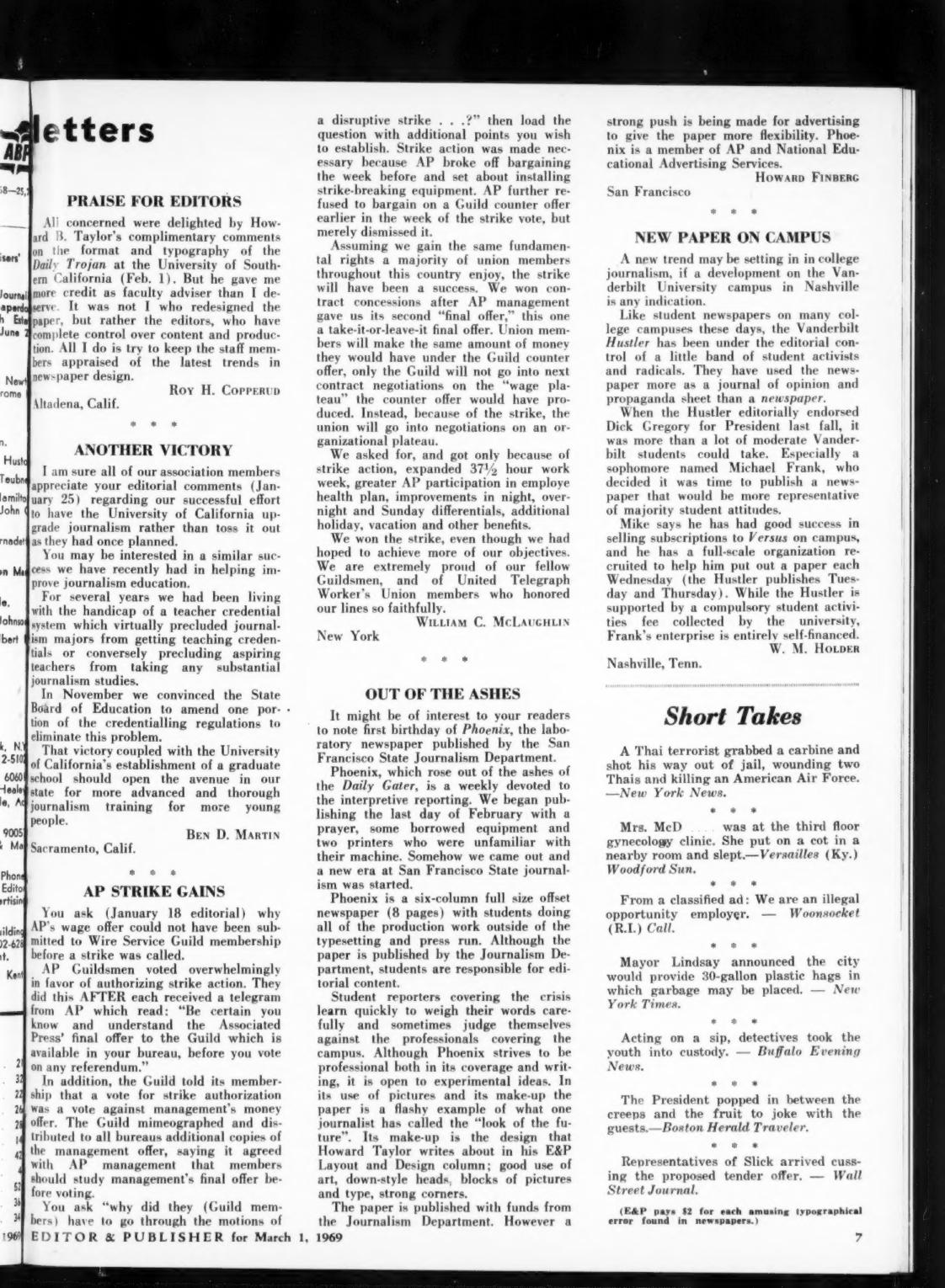
Editor & Publisher letters column from March 1, 1969, printing a letter about Phoenix, the San Francisco State laboratory newspaper

Out of the Ashes: A Letter to Editor & Publisher About the Phoenix

This is a letter of mine that ran in the letters column of Editor & Publisher for March 1, 1969. I was a journalism student at San Francisco State, and what I wanted the trade press to know was that our laboratory newspaper had made it through its first year.

It might be of interest to your readers to note the first birthday of Phoenix, the laboratory newspaper published by the San Francisco State Journalism Department.

The name was not subtle, and it wasn’t meant to be. The Phoenix came after the Daily Gater, and the letter says so plainly, along with a fairly honest account of how the first issue got out the door.

Phoenix, which rose out of the ashes of the Daily Gater, is a weekly devoted to interpretive reporting. We began publishing the last day of February with a prayer, some borrowed equipment and two printers (typesetters) who were unfamiliar with their machine. Somehow we came out and a new era in San Francisco State journalism was started.

What I described was a six-column, full-size offset paper, eight pages, with students doing all of the production work outside of the typesetting and the press run. The Journalism Department published it and paid for it, but, as I was careful to point out, students were responsible for the editorial content. We were pushing for advertising to give the paper more flexibility. The Phoenix was a member of AP and of National Educational Advertising Services.

The part of the letter I still think holds up is the paragraph about what it was like to be a student reporter on that campus, at that moment, with the professionals working the same story.

Student reporters covering the crisis learn quickly to weigh their words carefully and sometimes judge themselves against the professionals covering the campus.

And then, because even at that age I couldn’t resist talking about design, I spent a good chunk of a letter about a student newspaper describing its typography.

In its use of pictures and its make-up the paper is a flashy example of what one journalist has called the “look of the future.” Its make-up is the design that Howard Taylor writes about in his E&P Layout and Design column; good use of art, down-style heads, blocks of pictures and type, strong corners.

There’s a nice coincidence on the same page. The letter at the top of the column, from Roy H. Copperud of Altadena, Calif., is also responding to Howard Taylor’s design coverage — this time about the Daily Trojan at USC — and makes a point I would hear again and again in the years that followed about who actually does the work:

It was not I who redesigned the paper, but rather the editors, who have complete control over content and production.

A page of letters about student newspapers, journalism education in California, and the Wire Service Guild’s strike against the AP — and tucked in among them, a college student telling the industry’s trade magazine that the future would look a certain way on the page. The scan garbles my byline into “Howarp FInBerc,” which feels about right for a 1969 hot-type artifact making its way through a 21st-century scanner.