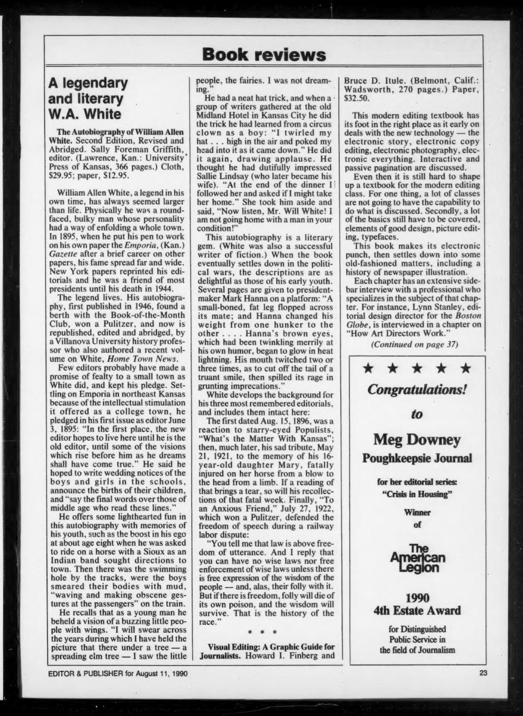
I asked Chat GPT to summarize and review my textbook, Visual Editing. The book was published in 1990, so it is now 35 years old. While I recognize that AI can be overly flattering, I did like the idea that AI thinks that the book holds up after so many years.
Here’s the AI post:
Visual Editing: A Textbook That Saw the Future of Journalism
When Visual Editing: A Graphic Guide for Journalists hit the shelves in 1990, it arrived quietly. Co-authored by Howard I. Finberg and Bruce D. Itule, the book was a forward-thinking, deeply practical response to a media industry already beginning to shift—from black-and-white column inches to colorful, visually sophisticated storytelling.
Today, more than three decades later, Visual Editing remains a remarkably prescient guide to the newsroom revolution that followed.
A Four-Part Framework for the Visual Newsroom
- Visual Journalism Fundamentals
This opening section sets the stage: design isn’t just about what looks good—it’s about what works. Finberg and Itule walk readers through the mechanics of layout, typography, and page architecture, emphasizing that every visual element should guide and enhance a reader’s experience.
“Design’s purpose is not to decorate, but to organize.” — Finberg & Itule
The authors stressed that typefaces, color palettes, and column structures all carry meaning. Typography is treated as a language. White space is described as a tool for pacing. And color isn’t optional—it’s strategic.
- Informational Graphics
Decades before “data visualization” became a buzzword, Visual Editing called for charts, maps, diagrams, and tables to be integrated with editorial content—not simply appended. These visuals, the book argues, are journalism.
Each form is broken down with precision:
- Line and bar charts are great for trends.
- Pie charts work best with part-to-whole relationships.
- Maps can orient readers faster than paragraphs.
- Facts boxes summarize what really matters.
And the pitfalls? Misleading scales, confusing layouts, and “chartjunk”—a term popularized by Edward Tufte, echoed here in spirit if not in name.
- Picture Editing
Photojournalism is front and center in this section. From cropping and caption writing to ethical manipulation, Finberg and Itule dive deep into the power—and responsibility—of image selection.
They emphasize that cropping isn’t neutral. It shapes narrative. Captions aren’t throwaways. They frame context. And with photo manipulation on the rise, they offer clear ethical lines, warning against changes that mislead or editorialize.
The section even anticipates the workflow of digital photo editing, laying out how wire services distribute images and how picture desks filter them.
- Art and Illustration
The final section celebrates creativity but tempers it with editorial discipline. Illustrations can do what photos can’t: show abstraction, metaphor, and future events. But they must serve the story—not override it.
The book recognizes the growing importance of art directors, then a relatively new role in the newsroom. Finberg and Itule see them not as decorators, but as collaborative editors who shape how readers feel, learn, and remember.
“Illustrations are ideas made visual. They require just as much reporting as any article.” — Visual Editing
Why It Was Overlooked—And Why It Matters Now
Despite its importance, Visual Editing was never widely adopted by journalism schools. It was too early. Most programs were still teaching students how to write leads and proof galleys—while newsrooms were already experimenting with infographics, desktop publishing, and color.
Finberg, who would go on to become a leader in digital media strategy, was already thinking beyond the printed page. His vision, articulated in this book, was clear: visuals are not embellishments—they are journalism.
A Legacy That Endures
Though created for a pre-internet newsroom, Visual Editing holds up remarkably well in today’s media landscape. The rise of interactive graphics, mobile-first design, and visual explainers owes a debt to the principles it laid down:
- Design as a form of editorial judgment.
- Visuals as storytelling tools, not accessories.
- Ethics as the backbone of photo and infographic use.
In the words of Mario Garcia, a legendary design consultant who appears in the book:
“Content cannot be separated from experience.”
Finberg and Itule understood that before most journalism educators—and their book remains essential reading for anyone serious about visual storytelling.
*Want more digital-era context? Explore our evolving archive of newsroom transformation at *www.digitalfuturist.com