Straits Times, Singapore, Workshops

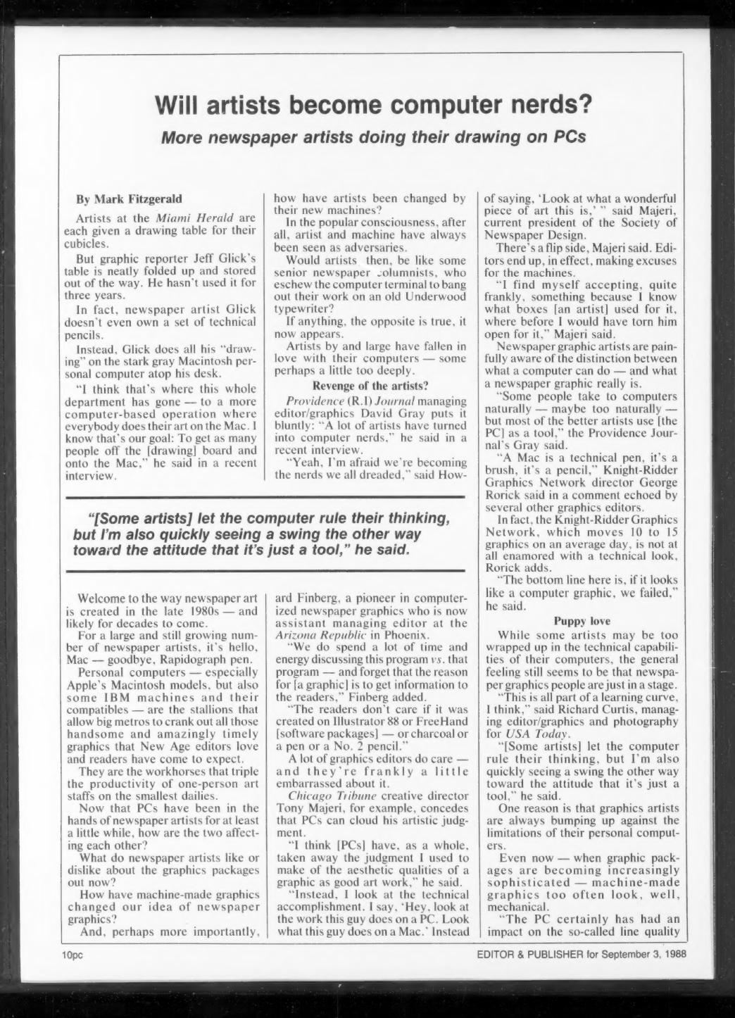
In 1993 I taught a series of workshops or training sessions at the Straits Times newspaper in Singapore.  These sessions were aimed at the copy editors and visual editors of the newspaper.  Attendees also came from the Business Times publication, the New Paper and two non-English language newspapers: Zaobao and Berita Harian. 

Actually, there were two weeks of training, with a different group for each workshop.

Workshop goals were:

  • The challenge of serving readers more fully today
  • The challenge of serving readers in the next century

And the topics covered were:`

    • Readership issues
    • Typography & readability
    • Designing
    • Photography
    • Graphics
    • Critique

At the end of each workshop, I looked at the Year 2000 and views of top designers and what the newsroom might be like.  This was based on an API seminar I attended and presented at.

I also did critiques of the Straits Times, the Business Times and the New Paper.

Celebrating The Republic’s Centennial: How We Worked

In 1990 The Arizona Republic celebrated its 100 years — its centennial. There were many different projects that I had role in editing and/or coordinating. It was a once in a lifetime project. One of the projects involved a full page timeline [called “Paper Route”] of how a story is reported, written and edited. In addition, how do photographers and others in the newsroom work to create the still ‘daily miracle.’

History of Newspaper Design and Year 2000 Visions

As part of the 1989 Associated Press Managing Editors convention Des Moines, I developed a script for a slideshow about the history of newspaper design and the vision developed from the American Press Institute’s seminar on the future of newspaper design.  That seminar, “Newspaper Design 2000 and Beyond,” was help in 1988.

The goal of the APME slide show was “look back so that we might look forward.”  [The  slide show was videotaped.]  Douglas Ramsey, who was a vice president at the Foundation for American Communications, did the narration. The AP put the show together.  Nancy Tobin, who was at The Asbury Park Press, helped with the creation of the show.

I found a VCR tape of the show, which is visually terrible.  However, I’ve posted it.  One of my goals is to take the narration, which was quite nice, and recreate the show in digital format.  Stay tuned. [Update in 2021: Still the plan. Life happens.]

YouTube player

The State of Newspaper Design

Design magazine, the publication of The Society of Newspaper Designers [SND] asked a number of editors to write about various aspects of the state of newspaper design.  I used my article talk about three key things:

  • Training [aka development]
  • Technology
  • Organizational structure

I like what I wrote about technology.

Technology: I’m not sure computers have been a blessing for journalists. I’m not interested in what kinds of tricks we can do with them but the facility with which we can do our jobs.

This edition‘s cover listed so many friends and industry colleagues.

Two ways of looking at an Adobe Acrobat Reader PDF file: on a Palm handheld device and on paper

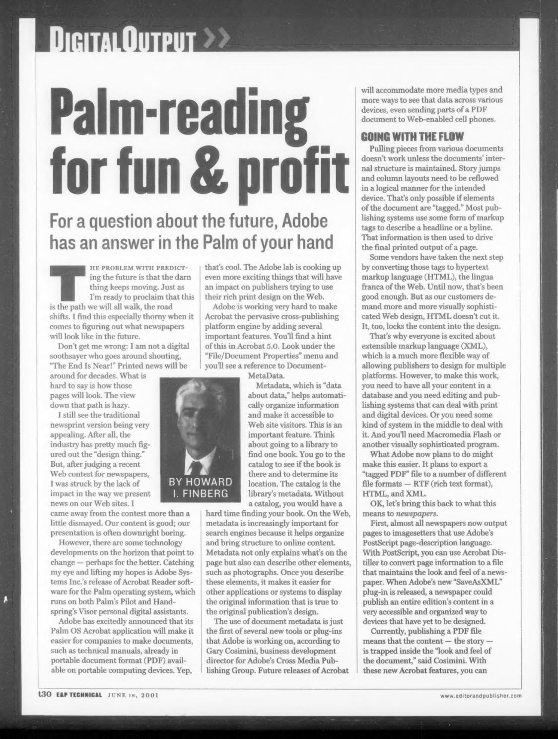
Palm-Reading for Fun & Profit

A column for Editor & Publisher‘s technical section, published June 15, 2001, under the headline “Palm-reading for fun & profit — For a question about the future, Adobe has an answer in the Palm of your hand.” The subject is Adobe Systems Inc.’s release of Acrobat Reader software for the Palm operating system, which ran on both Palm’s Pilot and Handspring’s Visor personal digital assistants, and what that development might mean for newspaper design across devices.

The problem with predicting the future is that the darn thing keeps moving. Just as I’m ready to proclaim that this is the path we will all walk, the road shifts.

The column argues that printed news will be around for decades, but that newspaper Web presentation was falling short. After judging a recent Web contest for newspapers, the verdict was blunt:

Our content is good; our presentation is often downright boring.

The technical discussion covers tagged documents, the limits of HTML — “It, too, locks the content into the design” — and the promise of extensible markup language (XML) for designing across multiple platforms. Gary Cosimini, business development director for Adobe’s Cross Media Publishing Group, is quoted on the state of PDF at the time, with the content “trapped inside the ‘look and feel of the document.'” The column describes Adobe’s plans to export a “tagged PDF” file to RTF, HTML and XML, and a forthcoming plug-in that would let a newspaper publish an entire edition’s content “to devices that have yet to be designed.”

Under the subhead “The Design Thing,” the column makes the case that publishing skill is itself a newspaper asset:

We know how to communicate by design. We organize and prioritize by design.

It closes by questioning whether the industry and its vendors were ready for a “handle-once” work flow publishing visually rich content across multiple devices, noting that competitors — CNET.com is the example — could run the process in reverse, converting XML- and HTML-formatted documents to PDF for print.

The road just shifted slightly, and there are warning signs ahead

The author’s note identifies Finberg as “a managing director of Finberg-Gentry, The Digital Futurist Consultancy,” with prior roles at The Arizona Republic in Phoenix, the Chicago Tribune, and the San Francisco Chronicle. An accompanying illustration showed “Two ways of looking at an Adobe PDF file: On a Palm device, on paper.”

Transcript pages from a 1999 American Press Institute seminar presenting newspaper design survey results

Is There a Disconnect Here Someplace?

This is a transcript section from an American Press Institute seminar held in October 1999, where I presented the results of a design and visuals survey I coordinated. It was a follow-up to the survey we did for the 1988 J. Montgomery Curtis seminar, Newspaper Design: 2000 and beyond, with a nod to the survey the Society of Newspaper Design did in 1992. We reused a lot of the same questions so we could see what had changed.

This just goes to show you that if you volunteer to do something, you get to do it again.

The numbers: 628 responses in 1988; a little over 1,200 in 1999, about 200 of those from a Web site we built for the project. Sixty percent came from designers, 40 percent from editors. Ninety percent worked at dailies, and about 45 percent at papers over 100,000 circulation. One notable difference from 1988 — we didn’t ask about color or the use of computers. By 1999 those were givens.

We organized the discussion around five areas: the importance of design, the importance of visual elements, people, the relationship between online and print (new that year), and where all of this material was going to fit in the future.

As for the importance of design, the survey showed that it remains strong in the opinion of both editors and designers. And as for visuals, we’re also optimistic. And that’s the good news. The bad news is there appears to be a big disconnect between editors and designers in how they view the world.

Some of that disconnect showed up in the self-scoring. Asked to rate the quality of newspaper design across the industry on a 1-to-10 scale, 13 percent gave the industry an 8 to 10 and 71 percent put it in the 5-to-7 range. Asked about their own newspapers, more than half rated themselves 8 to 10. As I said at the time: the industry sucks, but we’re doing okay at our own newspaper.

Warren Watson of API‘s staff took the results to some 50 publishers, editors, designers and educators for reaction, and it wasn’t flattering. Terry Quinn of Thomson Newspapers called the 1980s an infatuation period with design. Darrell Moen said design had simply become institutionalized — not special anymore. Around the table, Mr. Sutton put a sharper point on it:

I do think most editors see design simply as layout, and I believe there is a design backlash, because some visual journalists have too much of a “make it pretty” mentality.

The section on informational graphics was the one that stung. As a former graphics editor who toiled in that vineyard when we had nothing but rocks and stumps, I wondered aloud whether informational graphics had just been a fad. Others weren’t ready to concede that. Marty Petty argued that graphics still engage readers and that the failure was in execution — chasing the big, sexy stuff instead of the basic maps and charts that inform. Mr. Curtis tied it to incentives:

Today, editors don’t value them highly anymore because they aren’t rewarded for them, and if you aren’t rewarded, you don’t do it.

On people — which I said then, and still believe, is the greatest challenge — 80 percent of respondents found hiring qualified visual journalists either very difficult or about as hard as it had always been, and the survey said it was getting worse. Asked where they’d put additional staff money, respondents put reporting first at 53 percent, design at 37 percent, online at 30 percent, graphics at 28 percent, photography at 27 percent and illustration at 13 percent. Roger Fidler noted that at Kent State most of the better students were looking at the Web and electronic publishing, and saw newspapers as passé.

The online results astounded me. Only 10 percent thought it highly important that a newspaper’s Web site look like the printed newspaper; 50 percent said it wasn’t important at all. So much for brand. And on leveraging print journalists online, the responses split roughly in thirds — including a third who thought it wasn’t very important at all.

Then there was space. Sixty percent said they had more room for visual packages than five years earlier, and looking ahead, everybody expected still more — this with the 50-inch web coming at the industry.

Everybody thinks they’re going to have more space in the future…what planet were these people on when they answered this question.

Two quotes from the session have stayed with me. Juan Antonio Giner, relayed by Warren: “newspaper design is dead; news design is alive.” And Mr. Lockwood, closing the argument with the Bauhaus:

Laszlo Maholy-Nagy said years and years ago from the Bauhaus that design isn’t a profession; it is an attitude. It is an attitude about information.

I ended on a deliberately hopeful note, pointing out that in Blade Runner — one of the darker visions of the late 20th century — our hero waits for his dinner while reading a printed newspaper. Reading this back now, well past the 2020 horizon we were asked to imagine, the survey’s optimism about space looks even more misplaced, and the disconnect between editors and designers turned out to be the least of the industry’s problems. But the argument about whether visual work is content or decoration never really got settled. It just moved to a different screen.

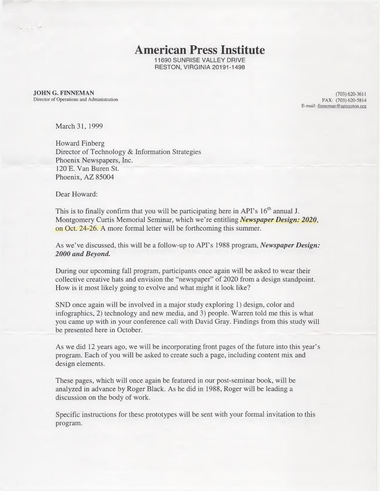
1999 American Press Institute letter from John G. Finneman confirming participation in the Newspaper Design: 2020 seminar

An Invitation To Imagine Newspaper Design: 2020

Eleven years after API’s Newspaper Design: 2000 and Beyond u2014 the 1988 seminar I’ve already posted documents about elsewhere on this site u2014 the American Press Institute decided to run the exercise again, this time looking two decades out. In the spring of 1999, John G. Finneman, API’s director of operations and administration, wrote to confirm that I’d be part of the 16th annual J. Montgomery Curtis Memorial Seminar in Reston.

This is to finally confirm that you will be participating here in API’s 16″ annual J. Montgomery Curtis Memorial Seminar, which we’re entitling Newspaper Design: 2020, on Oct. 24-26.

The letter is explicit about the lineage, and it’s worth reading alongside the 1988 material in the timeline:

As we’ve discussed, this will be a follow-up to API’s 1988 program, Newspaper Design: 2000 and Beyond.

At the time I was director of technology and information strategies at Phoenix Newspapers, Inc. u2014 a title that says something about how far the conversation had moved from the drafting table since the first seminar. The assignment, though, was the same one: put on the collective creative hat.

During our upcoming fall program, participants once again will be asked to wear their collective creative hats and envision the “newspaper” of 2020 from a design standpoint. How is it most likely going to evolve and what might it look like?

The quotation marks around “newspaper” are Finneman’s, and they do a lot of work.

The Society of News Design was again a partner, with a study organized around three buckets u2014 design, color and infographics; technology and new media; and people. Finneman credits the framing to a conference call I’d had with David Gray:

Warren told me this is what you came up with in your conference call with David Gray.

The signature element of the 1988 program came back as well. Each participant would build a front page of the future, content mix and all, for analysis and a post-seminar book.

These pages, which will once again be featured in our post-seminar book, will be analyzed in advance by Roger Black. As he did in 1988, Roger will be leading a discussion on the body of work.

The seminar was underwritten by API’s J. Montgomery Curtis Fund, which covered tuition, room and meals at the Hyatt Dulles, plus the production of the book. Participants paid their own way there. And, in a detail that dates the letter as surely as anything else in it, I was asked to send along a glossy photo and a biographical sketch.

Looking at this from 2026, the target year has come and gone u2014 and then some. What strikes me is that the 1988 group was asked to imagine 2000 largely as a printed artifact, while the 1999 group was being asked about 2020 with the web already reshaping the question. Whether any of us got it right is a matter for the front pages themselves.

Tabulations from the 1988 Society of Newspaper Design membership survey, prepared by The Arizona Republic's Market Research Department and dated August 9, 1988

SND’s First Membership Survey, 1988

In 1988, as SND Region 7 director — and an assistant managing editor at The Arizona Republic — I put the Society of Newspaper Design’s first-ever membership survey into the mail. The tabulations were prepared by the Republic’s Market Research Department and dated August 9, 1988.

The pitch to members was straightforward:

We need your help. Enclosed is the first ever SND membership survey. This survey will be used to evaluate current Society programs and publications, identify the areas that should be expanded and help in the development of new services.

The methodology section explains the mechanics: a six-page self-completion questionnaire mailed to 1,500 domestic and 200 foreign SND members on May 25, 1988, with the total membership serving as the sampling frame.

There were 775 usable questionnaires returned for a response rate of 46 percent.

A few numbers that still stand out. Ninety percent said their newsroom or art/graphics department had one or more personal computers — and among those, 92 percent were using Macintosh to create graphics or illustration. Asked what would become more important at their newspaper in the next five years, computers topped the list at 89 percent, followed by informational graphics at 83 percent, design principles at 79 percent and color at 76 percent.

Members were also generous about the Society itself: 82 percent thought dues were “about right,” 64 percent said they always read Design journal, and 93 percent liked its magazine format. The soft spots were attendance and awareness — only 41 percent had been to a workshop or convention in the previous two years, and the most common reasons given were “too far away” and “too costly.”

Chicago Tribune weather page from April 15, 1983, reproduced in the Society of Newspaper Design journal with outlook, satellite and temperature maps

Weather Page Design: Chicago Tribune and Atlanta

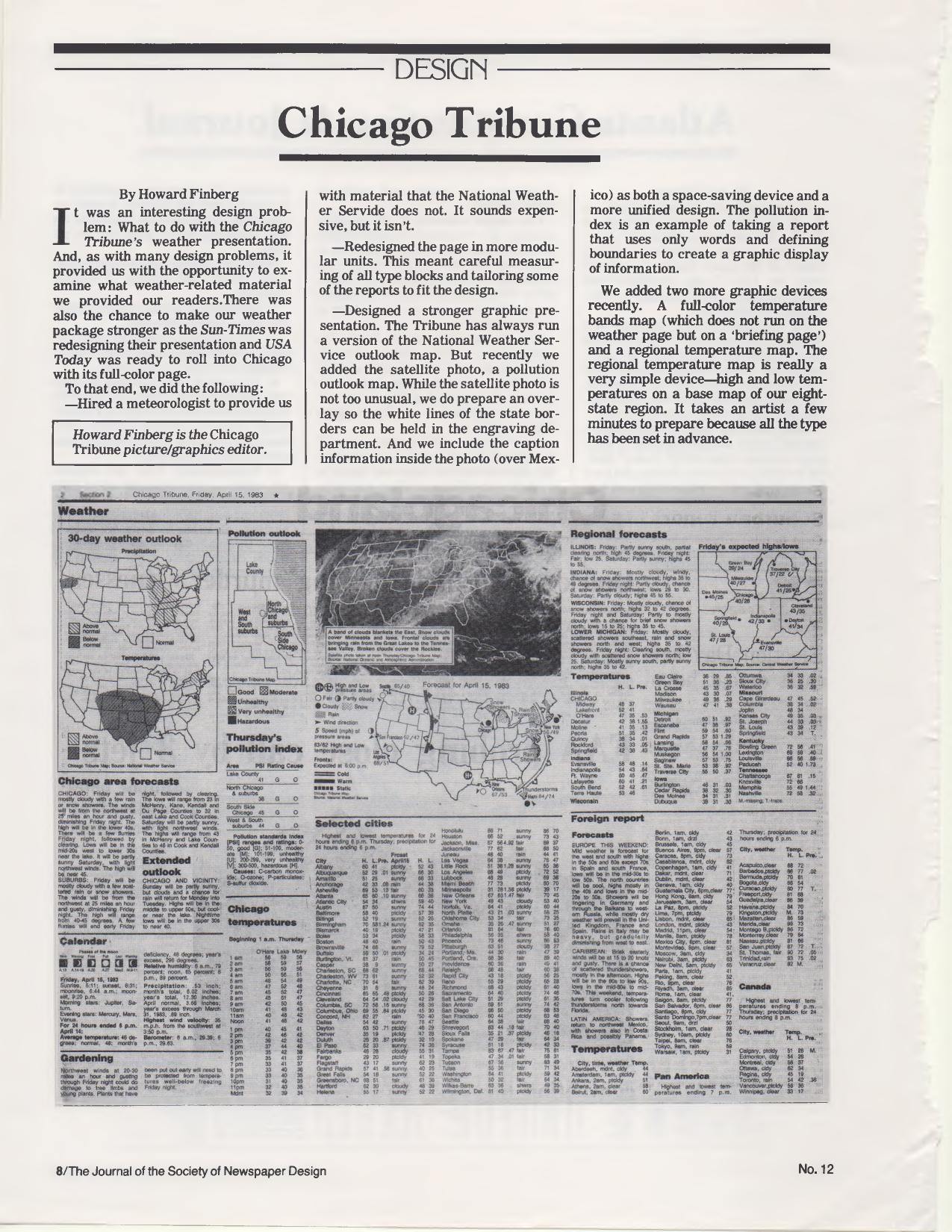
From The Journal of the Society of Newspaper Design, No. 12, a two-part look at newspaper weather packages. My piece describes the rethinking of the Chicago Tribune‘s weather presentation — done while the Sun-Times was redesigning its own weather page and USA Today was about to enter Chicago with a full-color version. The steps: hiring a meteorologist for material beyond what the National Weather Service supplied, rebuilding the page in modular units with carefully measured type blocks, and strengthening the graphics — the outlook map, a satellite photo with an engraving overlay to hold the white state borders, a pollution outlook map, a full-color temperature bands map on the briefing page, and a simple regional temperature map for the Tribune’s eight-state region. The example page reproduced with the article is dated Friday, April 15, 1983. At the time I was the Tribune’s picture/graphics editor.

The pollution index is an example of taking a report that uses only words and defining boundaries to create a graphic display of information.

It takes an artist a few minutes to prepare because all the type has been set in advance.

The facing article is by Joe Coleman, then photo editor of the Atlanta Journal & Constitution, on that paper’s half-page color weather map, developed as part of a redesign of the afternoon Journal. Coleman credits then-managing editor Eddie Sears:

Eddie Sears, had seen the USA Today prototype and found one thing worth stealing — an expanded weather map.

Coleman also describes adding columnist Charles Salter to personalize the data, and lists cautions for anyone building a weather package — designate a person responsible for gathering data, format as much as possible, and be careful about dropping cities:

We got more calls on dropping readers’ home towns or favorite foreign vacation spots than any other changes made over the past ten months.

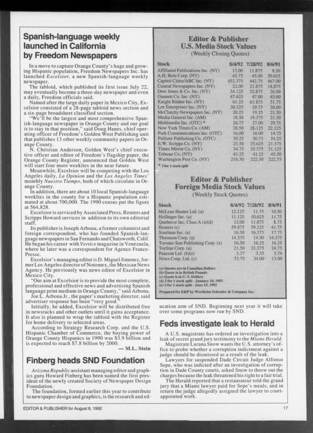
An interesting twist: Joe Coleman is the same Joe Coleman I would later hire as my photo editor at The Arizona Republic in the late 1980s.

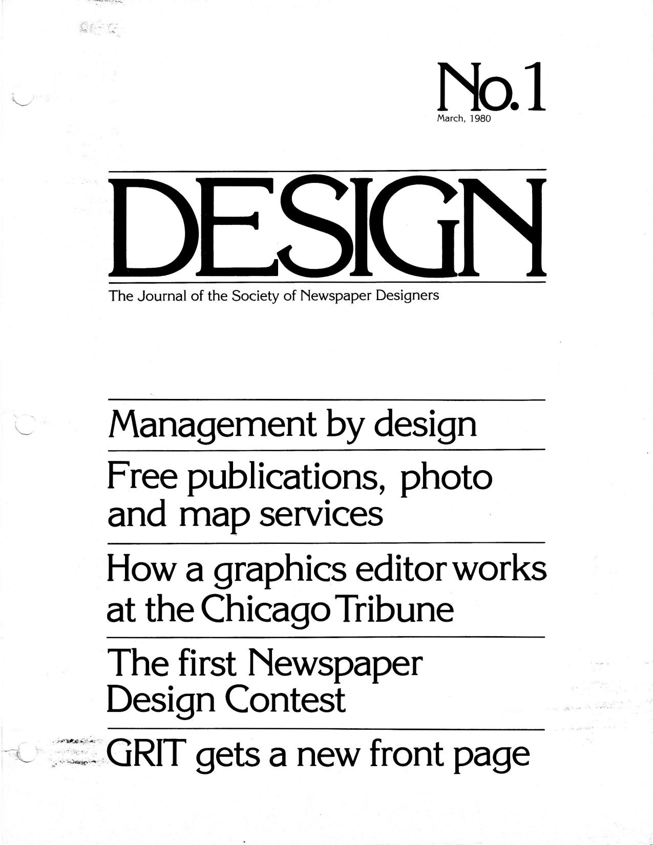
Cover of Design No. 1, March 1980, the Society of Newspaper Designers journal containing the "What is a graphics editor?" talk

“What Is a Graphics Editor?” — The First Issue of Design, March 1980

This is No. 1 of Design, the quarterly journal of the Society of Newspaper Designers, dated March 1, 1980 and edited by Richard Curtis, then assistant managing editor of The News American in Baltimore. The 32-page issue includes Louis Silverstein of The New York Times on design and content, Robert Lockwood’s essay on newspaper management by design, David B. Gray of the Providence Journal-Bulletin on the photo lab as a newsroom resource, Randy Miller’s report on the Kansas City Star/Times seminar, Ed Breen of the Marion (Ind.) Chronicle on words and pictures, a rundown of the Society’s first Newspaper Design Contest, and the redesign of GRIT’s front page.

Curtis used his editor’s note to explain where the organization came from — and how quickly it had grown.

The society was founded, rather informally, in 1978 in a bar in Reston, Virginia during the first American Press Institute seminar on newspaper design.

From a newsletter that went to all 12 members, the Society had reached more than 160 members, produced a videotape presentation called “News by Design,” and mounted its first workshop — held with the Chicago Tribune at the Hyatt Regency in Chicago on Sept. 28, 29 and 30, 1979, drawing nearly 150 participants from the United States, Canada and Costa Rica.

I have a byline in this issue, on a piece headlined “What is a graphics editor?” I didn’t write it. It is a transcription of the talk I gave at that first Chicago workshop, on Sept. 29, 1979, as graphics editor of the Chicago Tribune

My responsibilities at the Tribune are for all graphics that appear in the editorial pages. The question that often arises is, what’s a graphic? The way we define it is charts, maps, combinations… anything that is not what is described as pure illustration. In other words, if it has editorial matter — there are words with it — then it falls under the province of the graphic editor.

Much of the talk was about where the job sits in the newsroom — attending the two daily news meetings, reporting to the assistant managing editor, reading over a reporter’s shoulder before the story lands on the city desk. And about knowing when to say no:

Of course, there’s always one other function of the graphics editor that’s not as pleasant, and that’s knowing when to kill (a graphic). Because there’s nothing worse than a graphic that doesn’t work.

You can have the prettiest looking graphics in the paper and it doesn’t mean anything if it doesn’t communicate with readers.

The issue closes with a membership form ($20 a year, dues covering the magazine), a jobs listing, and a promise for No. 2: an issue built around the question the Kansas City seminar had put to editors — how do we do more with less? Forty-five years on, that’s still the question, and I would go on both to write for this magazine and to be written about in it.