Status of Informational Graphics in the U.S.: A Swiss Seminar Handout
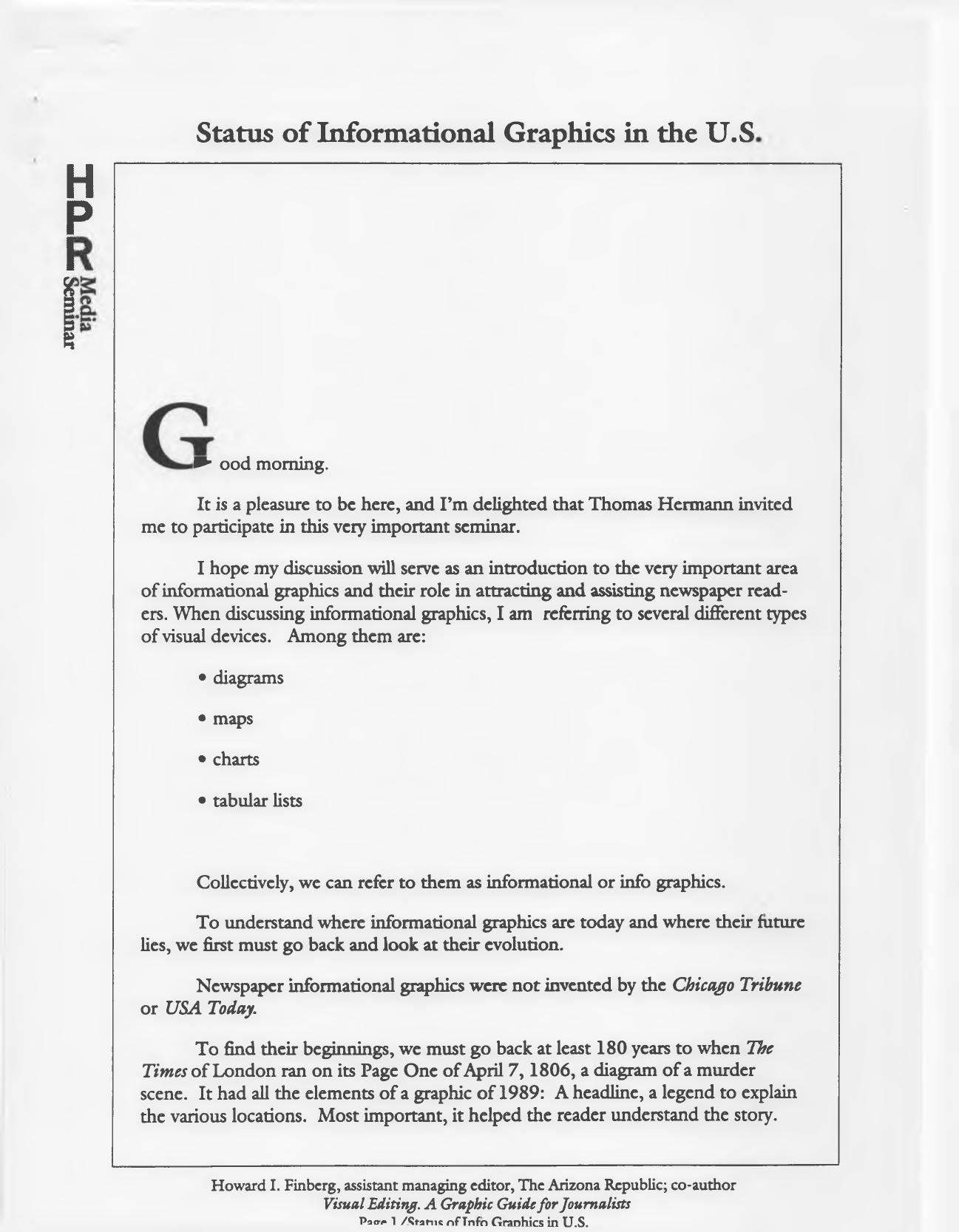
In the early 1990s I presented a seminar in Switzerland. Sadly, I don’t remember exactly when or where — which is why this file is going into the Archive section until more information turns up. The handout given to seminar participants also served as my speech. It draws on my then-newly published textbook, Visual Editing: A Graphic Guide for Journalists (1990). The document credits Thomas Hermann with the invitation.
The talk traces the evolution of informational graphics — diagrams, maps, charts and tabular lists — from a murder-scene diagram on Page One of The Times of London on April 7, 1806, through William Playfair’s 1786 The Commercial and Political Atlas, to war maps of World Wars I and II, the space program, and the arrival of USA Today on Sept. 15, 1982. Along the way it notes that the Chicago Tribune created a graphics editor position in 1974, one of the country’s first full-time visual journalists.
One of my favorite quotations, from the Austrian statistician Otto Neurath in 1925, appears early in the text:
“Words divide, pictures unite…to remember simplified pictures is better than to forget accurate figures.”
The handout also reports survey findings from more than 350 members of the American Society of Newspaper Editors, done in connection with the American Press Institute’s 1988 J. Montgomery Curtis seminar: 92 percent expected to use more informational graphics within five years, and 90 percent said graphics would play a greater role in their newspapers in the year 2000.
And a warning that still holds up:
When we run misleading graphics because of a lack of data points or “empty graphics” that are merely type-breakers, we communicate very little and take up precious news space.
The remainder of the handout is drawn from the textbook: chapters on how a graphics editor works — gathering and editing information, request forms, working with artists, fact checking — and a section on choosing the right device, with examples from The Arizona Republic illustrating tables and lists, line/fever charts, pie charts, pictograms, map graphics, and vertical and horizontal bar charts.