Visual Editing, a 2025 AI Assessment

I asked Chat GPT to summarize and review my textbook, Visual Editing. The book was published in 1990, so it is now 35 years old.  While I recognize that AI can be overly flattering, I did like the idea that AI thinks that the book holds up after so many years.

Here’s the AI post:

Visual Editing: A Textbook That Saw the Future of Journalism

When Visual Editing: A Graphic Guide for Journalists hit the shelves in 1990, it arrived quietly. Co-authored by Howard I. Finberg and Bruce D. Itule, the book was a forward-thinking, deeply practical response to a media industry already beginning to shift—from black-and-white column inches to colorful, visually sophisticated storytelling.

Today, more than three decades later, Visual Editing remains a remarkably prescient guide to the newsroom revolution that followed.

A Four-Part Framework for the Visual Newsroom

  1. Visual Journalism Fundamentals

This opening section sets the stage: design isn’t just about what looks good—it’s about what works. Finberg and Itule walk readers through the mechanics of layout, typography, and page architecture, emphasizing that every visual element should guide and enhance a reader’s experience.

“Design’s purpose is not to decorate, but to organize.” — Finberg & Itule

The authors stressed that typefaces, color palettes, and column structures all carry meaning. Typography is treated as a language. White space is described as a tool for pacing. And color isn’t optional—it’s strategic.

  1. Informational Graphics

Decades before “data visualization” became a buzzword, Visual Editing called for charts, maps, diagrams, and tables to be integrated with editorial content—not simply appended. These visuals, the book argues, are journalism.

Each form is broken down with precision:

  • Line and bar charts are great for trends.
  • Pie charts work best with part-to-whole relationships.
  • Maps can orient readers faster than paragraphs.
  • Facts boxes summarize what really matters.

And the pitfalls? Misleading scales, confusing layouts, and “chartjunk”—a term popularized by Edward Tufte, echoed here in spirit if not in name.

  1. Picture Editing

Photojournalism is front and center in this section. From cropping and caption writing to ethical manipulation, Finberg and Itule dive deep into the power—and responsibility—of image selection.

They emphasize that cropping isn’t neutral. It shapes narrative. Captions aren’t throwaways. They frame context. And with photo manipulation on the rise, they offer clear ethical lines, warning against changes that mislead or editorialize.

The section even anticipates the workflow of digital photo editing, laying out how wire services distribute images and how picture desks filter them.

  1. Art and Illustration

The final section celebrates creativity but tempers it with editorial discipline. Illustrations can do what photos can’t: show abstraction, metaphor, and future events. But they must serve the story—not override it.

The book recognizes the growing importance of art directors, then a relatively new role in the newsroom. Finberg and Itule see them not as decorators, but as collaborative editors who shape how readers feel, learn, and remember.

“Illustrations are ideas made visual. They require just as much reporting as any article.” — Visual Editing

Why It Was Overlooked—And Why It Matters Now

Despite its importance, Visual Editing was never widely adopted by journalism schools. It was too early. Most programs were still teaching students how to write leads and proof galleys—while newsrooms were already experimenting with infographics, desktop publishing, and color.

Finberg, who would go on to become a leader in digital media strategy, was already thinking beyond the printed page. His vision, articulated in this book, was clear: visuals are not embellishments—they are journalism.

A Legacy That Endures

Though created for a pre-internet newsroom, Visual Editing holds up remarkably well in today’s media landscape. The rise of interactive graphics, mobile-first design, and visual explainers owes a debt to the principles it laid down:

  • Design as a form of editorial judgment.
  • Visuals as storytelling tools, not accessories.
  • Ethics as the backbone of photo and infographic use.

In the words of Mario Garcia, a legendary design consultant who appears in the book:

“Content cannot be separated from experience.”

Finberg and Itule understood that before most journalism educators—and their book remains essential reading for anyone serious about visual storytelling.

*Want more digital-era context? Explore our evolving archive of newsroom transformation at *www.digitalfuturist.com
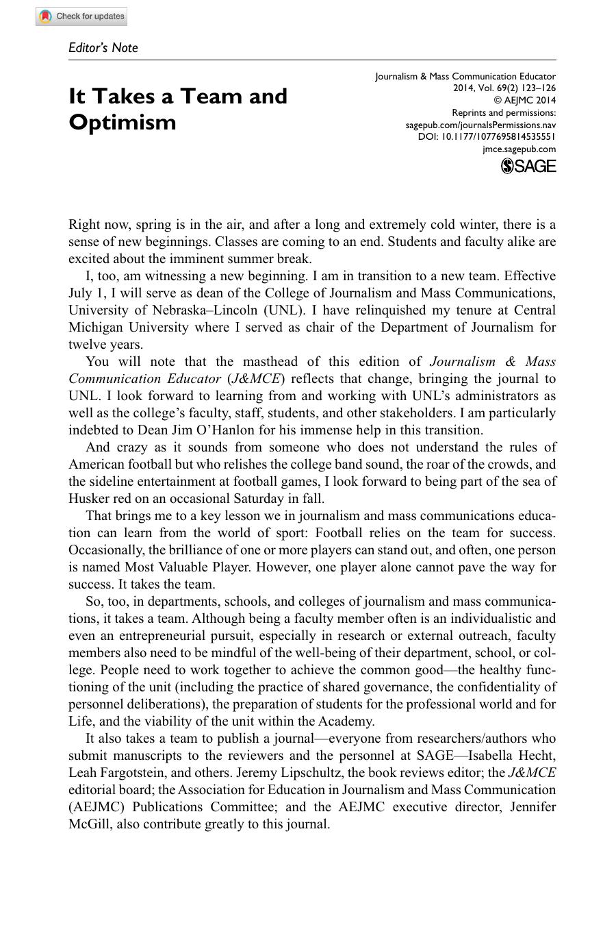
 

Editor's Note page from Journalism & Mass Communication Educator citing Poynter research on core journalism skills

Reasons for Optimism in Journalism, Education

This is an Editor’s Note from Journalism & Mass Communication Educator, written by Maria B. Marron, who was announcing her move to become dean of the College of Journalism and Mass Communications at the University of Nebraska–Lincoln. Most of the piece is about teams — how departments, schools and journals all depend on people working together rather than on a single star player. Then it turns to optimism, and that is where my work shows up.

Marron cited two sources for her optimism about the future of journalism and journalism education. The first was Marty Baron, then editor of The Washington Post, from his keynote at the fifteenth International Symposium on Online Journalism at the University of Texas–Austin:

There is no acceptable alternative to optimism.

The second was my writing about The Core Skills for the Future of Journalism report, which Poynter released on April 9, 2014. The report was research I did with my co-author, Lauren Klinger. Marron quoted my summary of what we found:

shows a wide divergence between professionals and educators in their thinking on the importance of core journalism skills, especially those skills that are essential for mastering new methods of gathering and delivering news and information.

The survey behind the report identified thirty-seven skills, attributes and knowledge areas judged important “for a beginning journalist as he/she looks toward his/her career in the digital/mobile age.” The widest gaps were in multimedia. Marron laid out the numbers: 76 percent of educators versus 46 percent of professionals rated “shoot and edit video” as important; 80 percent versus 52 percent on the “ability to tell stories with design and visuals”; 79 percent versus 53 percent on shooting and editing photographs; and 72 percent versus 38 percent on recording and editing audio. Coding was the outlier in a different direction — students rated the ability to work with HTML or another computer language highly, while only 41 percent of educators and 28 percent of professionals and managers did.

What interests me is how she read those gaps. Lauren and I had framed the divergence as a problem for the industry. Marron read the same data as evidence that educators were ahead of the professionals:

educators are serving as leaders for the industry, not as followers.

That is a more generous interpretation than the one we offered, and it is a fair one. The Core Skills research grew out of years of thinking about training at Poynter’s News University, where the question was always the same: what does a journalist actually need to know, and who is responsible for teaching it? The 2014 answer was that educators, students and freelancers largely agreed with each other, and newsroom professionals were somewhere else entirely.

Reading this in 2026, the specific skills have shifted — the argument now is about AI tools rather than shooting video — but the underlying gap between what the academy teaches and what newsrooms say they value has not gone away. Neither, I hope, has the optimism.

A Telegram From Washington: Named a 1971 Sears Congressional Journalism Intern

In 1970, big news arrived on paper, delivered to your door. Not email, not a phone call, not a text message — a Western Union telegram, all capital letters, punctuation spelled out or dropped, and the sender paying by the word. This one came to my parents’ house on Ortega Street in San Francisco while I was a journalism student at San Francisco State.

THE AWARDS COMMITTEE HAS NAMED YOU A 1971 SEARS CONGRESSIONAL JOURNALISM INTERN AND IS ARRANGING FOR YOUR APPOINTMENT TO A CONGRESSIONAL OFFICE STAFF, FULL DETAILS WILL FOLLOW BY LETTER IN MID-JUNE, PLEASE SEND IMMEDIATELY YOUR SUMMER ADDRESS AND TELEPHONE NUMBER ROTH AT RESIDENCE AND PLACE OF EMPLOYMENT. CONGRATULATIONSS

The telegram is dated May 20, 1970, and it is signed by:

JOHN L WHEELER, VICE PRESIDENT, GOVERNMENTAL AFFAIRS, SEARS, ROEBUCK AND CO, 1211 CONNECTICUT AVENLE WASHINGTON, D.C. 20056

Note the address: the telegram was sent by a corporate executive in Washington, D.C. The awards committee named the interns; the details — where you would actually be working, and for whom — would follow by letter in mid-June. In other words, you were told you had won before anyone could tell you what you had won.

The image itself is a reminder of how these documents were made. The routing codes across the top, the operator’s marks, the transmission time stamps, the form number at the bottom — all of it printed around a message that a machine typed out at the receiving end. The optical character reader stumbles over parts of it, which is fair; so does the eye. “BOTH” became “ROTH.” “AVENUE” became “AVENLE.”

Looking at it now, more than fifty years on, what strikes me is that a piece of news that changed the direction of a young journalist’s year came as a fragile sheet of paper with a glued-on tape of type. Today the same message would be an email, or a notification on a phone, gone from view in a week and unfindable in a year. The telegram survived because it was an object, and because I thought it was worth keeping. That is a decent argument for archives, and part of why these documents are here.

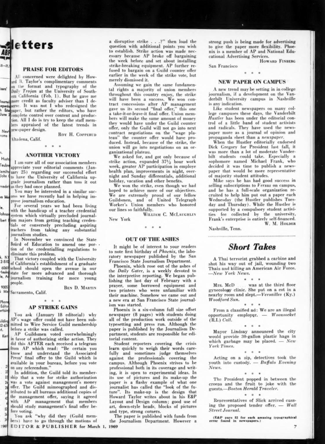
Editor & Publisher letters column from March 1, 1969, printing a letter about Phoenix, the San Francisco State laboratory newspaper

Out of the Ashes: A Letter to Editor & Publisher About the Phoenix

This is a letter of mine that ran in the letters column of Editor & Publisher for March 1, 1969. I was a journalism student at San Francisco State, and what I wanted the trade press to know was that our laboratory newspaper had made it through its first year.

It might be of interest to your readers to note the first birthday of Phoenix, the laboratory newspaper published by the San Francisco State Journalism Department.

The name was not subtle, and it wasn’t meant to be. The Phoenix came after the Daily Gater, and the letter says so plainly, along with a fairly honest account of how the first issue got out the door.

Phoenix, which rose out of the ashes of the Daily Gater, is a weekly devoted to interpretive reporting. We began publishing the last day of February with a prayer, some borrowed equipment and two printers (typesetters) who were unfamiliar with their machine. Somehow we came out and a new era in San Francisco State journalism was started.

What I described was a six-column, full-size offset paper, eight pages, with students doing all of the production work outside of the typesetting and the press run. The Journalism Department published it and paid for it, but, as I was careful to point out, students were responsible for the editorial content. We were pushing for advertising to give the paper more flexibility. The Phoenix was a member of AP and of National Educational Advertising Services.

The part of the letter I still think holds up is the paragraph about what it was like to be a student reporter on that campus, at that moment, with the professionals working the same story.

Student reporters covering the crisis learn quickly to weigh their words carefully and sometimes judge themselves against the professionals covering the campus.

And then, because even at that age I couldn’t resist talking about design, I spent a good chunk of a letter about a student newspaper describing its typography.

In its use of pictures and its make-up the paper is a flashy example of what one journalist has called the “look of the future.” Its make-up is the design that Howard Taylor writes about in his E&P Layout and Design column; good use of art, down-style heads, blocks of pictures and type, strong corners.

There’s a nice coincidence on the same page. The letter at the top of the column, from Roy H. Copperud of Altadena, Calif., is also responding to Howard Taylor’s design coverage — this time about the Daily Trojan at USC — and makes a point I would hear again and again in the years that followed about who actually does the work:

It was not I who redesigned the paper, but rather the editors, who have complete control over content and production.

A page of letters about student newspapers, journalism education in California, and the Wire Service Guild’s strike against the AP — and tucked in among them, a college student telling the industry’s trade magazine that the future would look a certain way on the page. The scan garbles my byline into “Howarp FInBerc,” which feels about right for a 1969 hot-type artifact making its way through a 21st-century scanner.