This is a transcript section from an American Press Institute seminar held in October 1999, where I presented the results of a design and visuals survey I coordinated. It was a follow-up to the survey we did for the 1988 J. Montgomery Curtis seminar, Newspaper Design: 2000 and beyond, with a nod to the survey the Society of Newspaper Design did in 1992. We reused a lot of the same questions so we could see what had changed.
This just goes to show you that if you volunteer to do something, you get to do it again.
The numbers: 628 responses in 1988; a little over 1,200 in 1999, about 200 of those from a Web site we built for the project. Sixty percent came from designers, 40 percent from editors. Ninety percent worked at dailies, and about 45 percent at papers over 100,000 circulation. One notable difference from 1988 — we didn’t ask about color or the use of computers. By 1999 those were givens.
We organized the discussion around five areas: the importance of design, the importance of visual elements, people, the relationship between online and print (new that year), and where all of this material was going to fit in the future.
As for the importance of design, the survey showed that it remains strong in the opinion of both editors and designers. And as for visuals, we’re also optimistic. And that’s the good news. The bad news is there appears to be a big disconnect between editors and designers in how they view the world.
Some of that disconnect showed up in the self-scoring. Asked to rate the quality of newspaper design across the industry on a 1-to-10 scale, 13 percent gave the industry an 8 to 10 and 71 percent put it in the 5-to-7 range. Asked about their own newspapers, more than half rated themselves 8 to 10. As I said at the time: the industry sucks, but we’re doing okay at our own newspaper.
Warren Watson of API‘s staff took the results to some 50 publishers, editors, designers and educators for reaction, and it wasn’t flattering. Terry Quinn of Thomson Newspapers called the 1980s an infatuation period with design. Darrell Moen said design had simply become institutionalized — not special anymore. Around the table, Mr. Sutton put a sharper point on it:
I do think most editors see design simply as layout, and I believe there is a design backlash, because some visual journalists have too much of a “make it pretty” mentality.
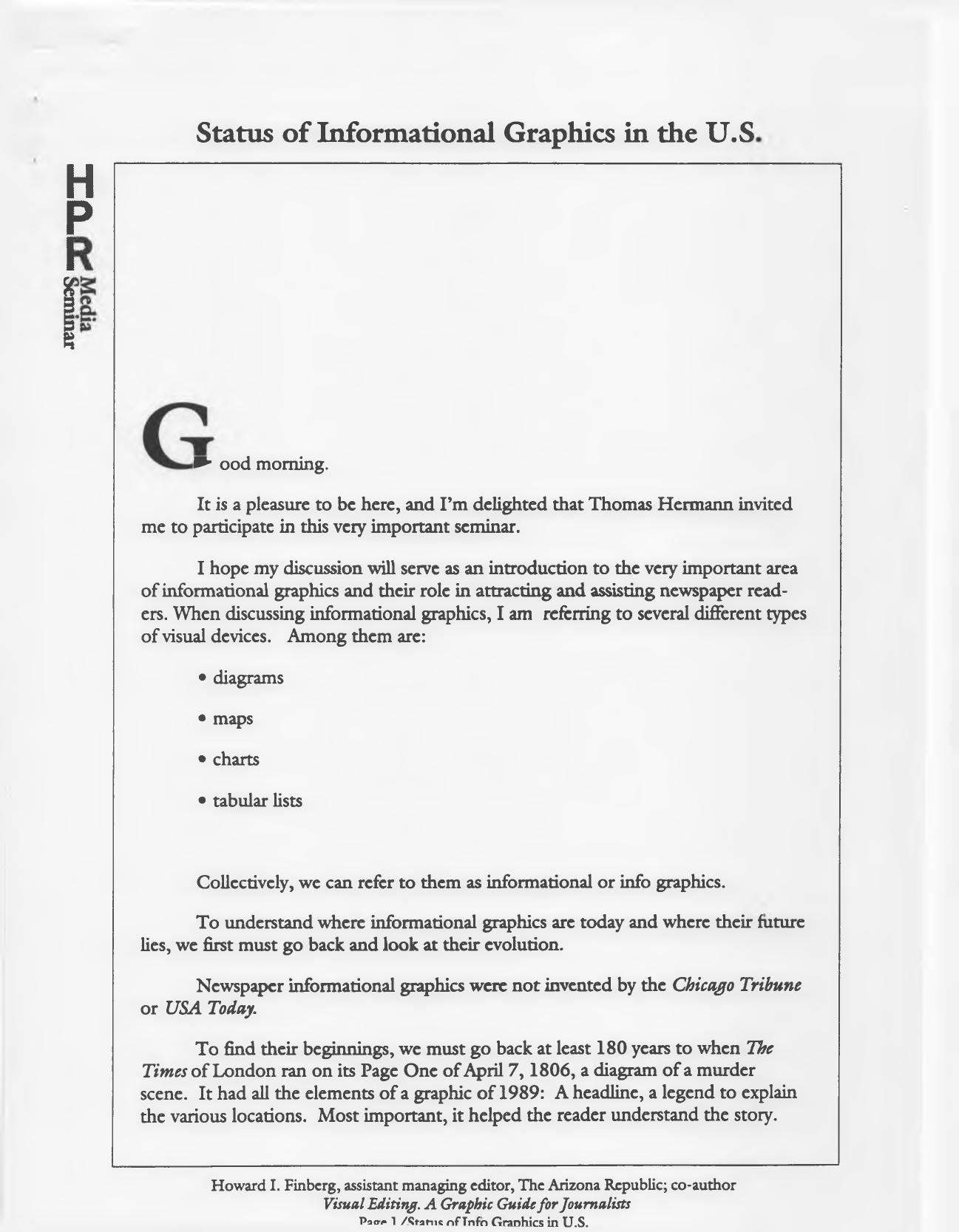
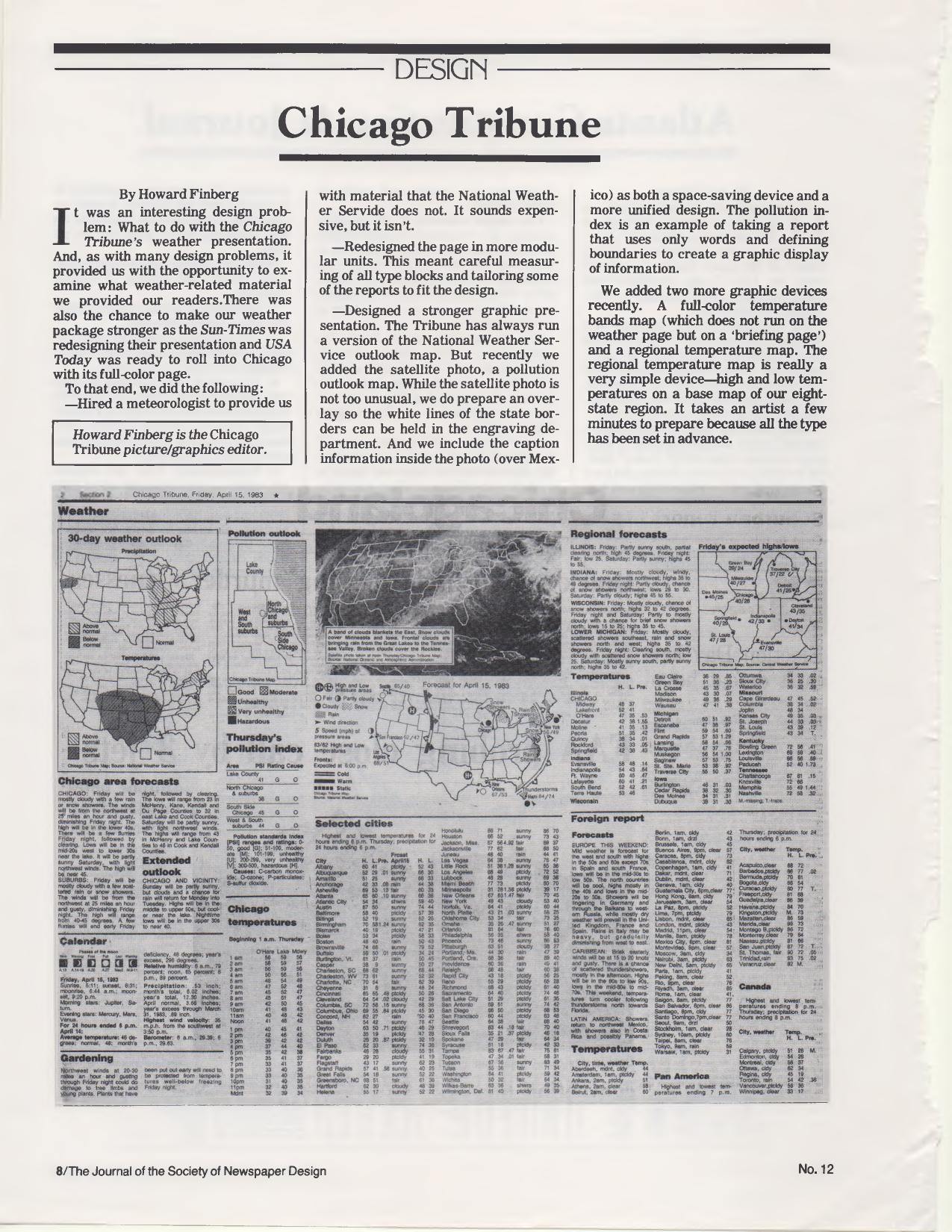
The section on informational graphics was the one that stung. As a former graphics editor who toiled in that vineyard when we had nothing but rocks and stumps, I wondered aloud whether informational graphics had just been a fad. Others weren’t ready to concede that. Marty Petty argued that graphics still engage readers and that the failure was in execution — chasing the big, sexy stuff instead of the basic maps and charts that inform. Mr. Curtis tied it to incentives:
Today, editors don’t value them highly anymore because they aren’t rewarded for them, and if you aren’t rewarded, you don’t do it.
On people — which I said then, and still believe, is the greatest challenge — 80 percent of respondents found hiring qualified visual journalists either very difficult or about as hard as it had always been, and the survey said it was getting worse. Asked where they’d put additional staff money, respondents put reporting first at 53 percent, design at 37 percent, online at 30 percent, graphics at 28 percent, photography at 27 percent and illustration at 13 percent. Roger Fidler noted that at Kent State most of the better students were looking at the Web and electronic publishing, and saw newspapers as passé.
The online results astounded me. Only 10 percent thought it highly important that a newspaper’s Web site look like the printed newspaper; 50 percent said it wasn’t important at all. So much for brand. And on leveraging print journalists online, the responses split roughly in thirds — including a third who thought it wasn’t very important at all.
Then there was space. Sixty percent said they had more room for visual packages than five years earlier, and looking ahead, everybody expected still more — this with the 50-inch web coming at the industry.
Everybody thinks they’re going to have more space in the future…what planet were these people on when they answered this question.
Two quotes from the session have stayed with me. Juan Antonio Giner, relayed by Warren: “newspaper design is dead; news design is alive.” And Mr. Lockwood, closing the argument with the Bauhaus:
Laszlo Maholy-Nagy said years and years ago from the Bauhaus that design isn’t a profession; it is an attitude. It is an attitude about information.
I ended on a deliberately hopeful note, pointing out that in Blade Runner — one of the darker visions of the late 20th century — our hero waits for his dinner while reading a printed newspaper. Reading this back now, well past the 2020 horizon we were asked to imagine, the survey’s optimism about space looks even more misplaced, and the disconnect between editors and designers turned out to be the least of the industry’s problems. But the argument about whether visual work is content or decoration never really got settled. It just moved to a different screen.