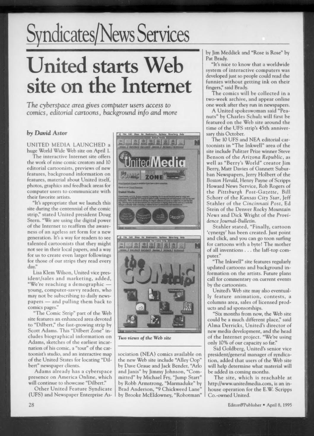
A syndicates and news services page from the April 8, 1995, issue of Editor & Publisher, reported by David Astor. The lead story covers United Media‘s April 1 launch of a World Wide Web site at http://www.unitedmedia.com — an in-house operation for the E.W. Scripps Co.-owned syndicate — carrying the work of nine comic creators and 10 editorial cartoonists, along with feature previews, background information, photos, graphics and feedback areas.
Comics from United Feature Syndicate and Newspaper Enterprise Association were to be collected in a two-week archive and posted online one week after newspaper publication. “The Comic Strip” section included an enhanced “Dilbert Zone” devoted to Scott Adams‘ strip, with biographical material, early sketches, a “tour” of the studio and an interactive map for locating “Dilbert” client newspapers; Adams also maintained a presence on America Online. “The Inkwell” area featured the editorial cartoonists, among them Pulitzer Prize winner Steve Benson of the Arizona Republic.
From United president Doug Stern:
“We are using the digital power of the Internet to reaffirm the awareness of an ageless art form for a new generation. It’s a way for readers to see talented cartoonists that they might not see in their local papers, and a way for us to create even larger followings for those of our strips they read every day.”
Lisa Klem Wilson, United vice president/sales and marketing, framed the audience question:
“We’re reaching a demographic — young, computer-savvy readers, who may not be subscribing to daily newspapers — and pulling them back to comics pages.”
Alma Derricks, United’s director of new media development and head of the Internet project, said the site could eventually add animation, contests, a columns area, licensed product sales and ad sponsorships:
“Six months from now, the Web site could be a much different place. We’re using only 10% of our capacity so far.”
The rest of the page carries shorter items: centennial-of-comics events announced by the Newspaper Features Council, including Sunday night live chat sessions with cartoonists on America Online beginning May 7 with Mort Walker, an AOL centennial area starting May 5, a Library of Congress comics exhibit, U.S. Postal Service cartoon stamps, and an October comic fair in Bryant Park; Universal Press Syndicate‘s new statistics column “Unconventional Wisdom” by Washington Post polling director Richard Morin; Tribune Media Services‘ new panel “True!” by Daryl Cagle; the debut of Tool User Comics, an “online comic book publisher” on the Web; Ray Walker’s promotion to news editor of Knight-Ridder/Tribune News Service; and “Jill Jackson’s Hollywood” from the King Features Weekly Service.