Tabulations from the 1988 Society of Newspaper Design membership survey, prepared by The Arizona Republic's Market Research Department and dated August 9, 1988

SND’s First Membership Survey, 1988

In 1988, as SND Region 7 director — and an assistant managing editor at The Arizona Republic — I put the Society of Newspaper Design’s first-ever membership survey into the mail. The tabulations were prepared by the Republic’s Market Research Department and dated August 9, 1988.

The pitch to members was straightforward:

We need your help. Enclosed is the first ever SND membership survey. This survey will be used to evaluate current Society programs and publications, identify the areas that should be expanded and help in the development of new services.

The methodology section explains the mechanics: a six-page self-completion questionnaire mailed to 1,500 domestic and 200 foreign SND members on May 25, 1988, with the total membership serving as the sampling frame.

There were 775 usable questionnaires returned for a response rate of 46 percent.

A few numbers that still stand out. Ninety percent said their newsroom or art/graphics department had one or more personal computers — and among those, 92 percent were using Macintosh to create graphics or illustration. Asked what would become more important at their newspaper in the next five years, computers topped the list at 89 percent, followed by informational graphics at 83 percent, design principles at 79 percent and color at 76 percent.

Members were also generous about the Society itself: 82 percent thought dues were “about right,” 64 percent said they always read Design journal, and 93 percent liked its magazine format. The soft spots were attendance and awareness — only 41 percent had been to a workshop or convention in the previous two years, and the most common reasons given were “too far away” and “too costly.”
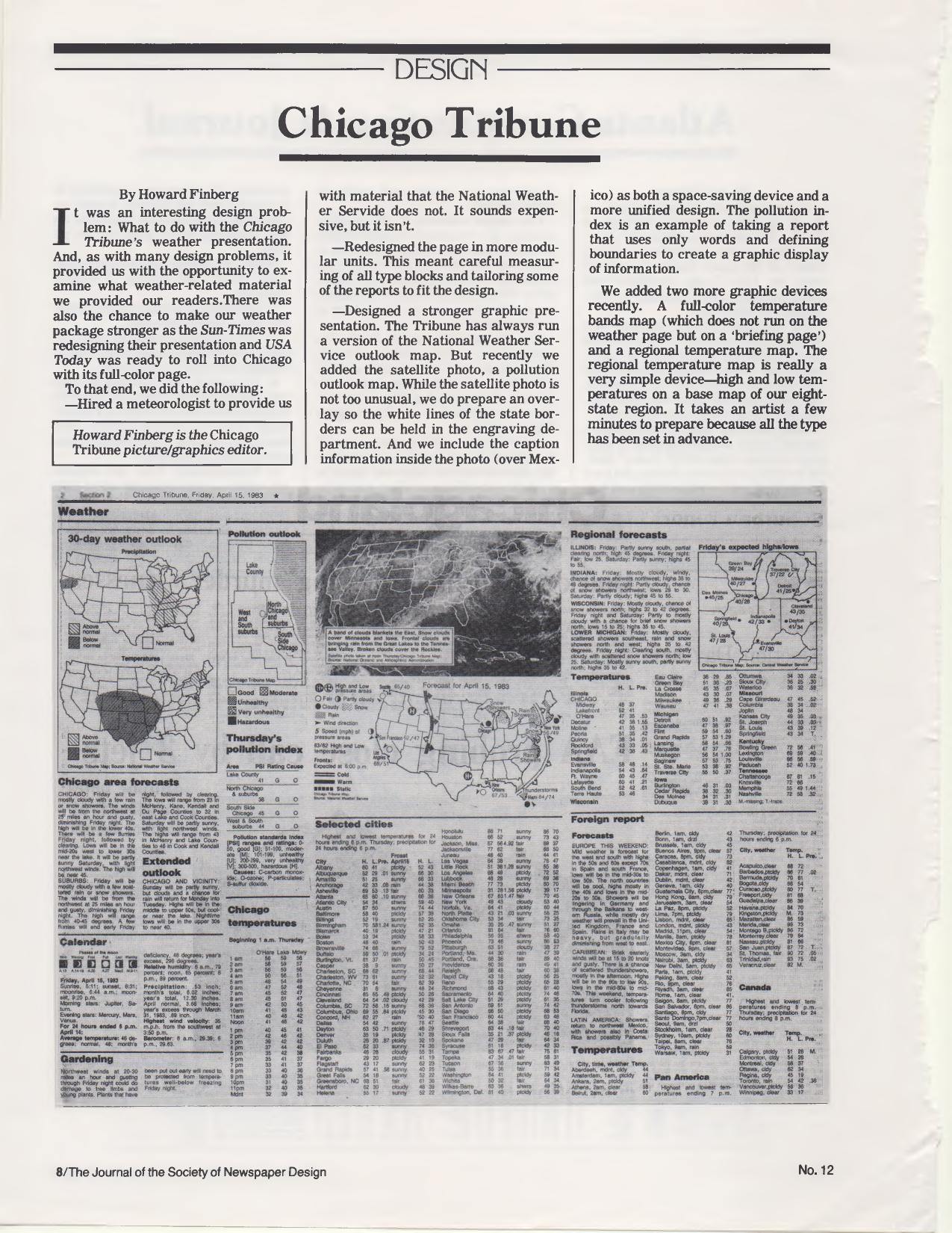
Chicago Tribune weather page from April 15, 1983, reproduced in the Society of Newspaper Design journal with outlook, satellite and temperature maps

Weather Page Design: Chicago Tribune and Atlanta

From The Journal of the Society of Newspaper Design, No. 12, a two-part look at newspaper weather packages. My piece describes the rethinking of the Chicago Tribune‘s weather presentation — done while the Sun-Times was redesigning its own weather page and USA Today was about to enter Chicago with a full-color version. The steps: hiring a meteorologist for material beyond what the National Weather Service supplied, rebuilding the page in modular units with carefully measured type blocks, and strengthening the graphics — the outlook map, a satellite photo with an engraving overlay to hold the white state borders, a pollution outlook map, a full-color temperature bands map on the briefing page, and a simple regional temperature map for the Tribune’s eight-state region. The example page reproduced with the article is dated Friday, April 15, 1983. At the time I was the Tribune’s picture/graphics editor.

The pollution index is an example of taking a report that uses only words and defining boundaries to create a graphic display of information.

It takes an artist a few minutes to prepare because all the type has been set in advance.

The facing article is by Joe Coleman, then photo editor of the Atlanta Journal & Constitution, on that paper’s half-page color weather map, developed as part of a redesign of the afternoon Journal. Coleman credits then-managing editor Eddie Sears:

Eddie Sears, had seen the USA Today prototype and found one thing worth stealing — an expanded weather map.

Coleman also describes adding columnist Charles Salter to personalize the data, and lists cautions for anyone building a weather package — designate a person responsible for gathering data, format as much as possible, and be careful about dropping cities:

We got more calls on dropping readers’ home towns or favorite foreign vacation spots than any other changes made over the past ten months.

An interesting twist: Joe Coleman is the same Joe Coleman I would later hire as my photo editor at The Arizona Republic in the late 1980s.

Cover of Design No. 1, March 1980, the Society of Newspaper Designers journal containing the "What is a graphics editor?" talk

“What Is a Graphics Editor?” — The First Issue of Design, March 1980

This is No. 1 of Design, the quarterly journal of the Society of Newspaper Designers, dated March 1, 1980 and edited by Richard Curtis, then assistant managing editor of The News American in Baltimore. The 32-page issue includes Louis Silverstein of The New York Times on design and content, Robert Lockwood’s essay on newspaper management by design, David B. Gray of the Providence Journal-Bulletin on the photo lab as a newsroom resource, Randy Miller’s report on the Kansas City Star/Times seminar, Ed Breen of the Marion (Ind.) Chronicle on words and pictures, a rundown of the Society’s first Newspaper Design Contest, and the redesign of GRIT’s front page.

Curtis used his editor’s note to explain where the organization came from — and how quickly it had grown.

The society was founded, rather informally, in 1978 in a bar in Reston, Virginia during the first American Press Institute seminar on newspaper design.

From a newsletter that went to all 12 members, the Society had reached more than 160 members, produced a videotape presentation called “News by Design,” and mounted its first workshop — held with the Chicago Tribune at the Hyatt Regency in Chicago on Sept. 28, 29 and 30, 1979, drawing nearly 150 participants from the United States, Canada and Costa Rica.

I have a byline in this issue, on a piece headlined “What is a graphics editor?” I didn’t write it. It is a transcription of the talk I gave at that first Chicago workshop, on Sept. 29, 1979, as graphics editor of the Chicago Tribune. 

My responsibilities at the Tribune are for all graphics that appear in the editorial pages. The question that often arises is, what’s a graphic? The way we define it is charts, maps, combinations… anything that is not what is described as pure illustration. In other words, if it has editorial matter — there are words with it — then it falls under the province of the graphic editor.

Much of the talk was about where the job sits in the newsroom — attending the two daily news meetings, reporting to the assistant managing editor, reading over a reporter’s shoulder before the story lands on the city desk. And about knowing when to say no:

Of course, there’s always one other function of the graphics editor that’s not as pleasant, and that’s knowing when to kill (a graphic). Because there’s nothing worse than a graphic that doesn’t work.

You can have the prettiest looking graphics in the paper and it doesn’t mean anything if it doesn’t communicate with readers.

The issue closes with a membership form ($20 a year, dues covering the magazine), a jobs listing, and a promise for No. 2: an issue built around the question the Kansas City seminar had put to editors — how do we do more with less? Forty-five years on, that’s still the question, and I would go on both to write for this magazine and to be written about in it.