Pushing for Better Informational Graphics

One of the interesting challenges of creating a new kind of editing role, the graphics editor, was helping others in the newsroom see the importance of involving the visual folks early in the process.  Roger Fidler, a like-minded design advocate in the 1970s,  created the Newspaper Design Notebook, a magazine/newsletter to push the concept of better design, better editing and better visuals.  He asked me to write an article about how the Chicago Tribune handled series and lessons other newspapers might learn from our experiences.  Vol. 3/No. 2 was the last edition of the Newspaper Design Notebook. Pity.

Planning. Teamwork. Execution.

These are the elements for the successful handling of a newspaper series. Unfortunately, no matter how valid that concept, most series are put together by luck, guts and a prayer.

Chicago Tribune Graphics Service’s 1st Catalog

The success of the Chicago Tribune’s graphics desk allowed the company to offer a service.  We would send out slick sheets of graphics via express mail service on Saturday.  The first index provided a catalog of the more than 1,000 graphics sent to subscribers in the 70 weeks since the service started.  What we have tried to do is provide a list of the material that has some shelf life [usable after a period of time] or a graphic that could provide the base for  a graphic  that can be updated with  new information.

Here are the folks who made it work:

This index was put together under the direction of  Howard Finberg, Graphics Editor of the Chicago Tribune, with the appreciated assistance of Mark Maynard, an editing  assistant. Larry Townsend, Director of the Graphics Service and editor of the KNT News Wire at the Tribune, has had the difficult task of updating the file weekly and trying to make the project as handy for other editors as it has been for us. Tony Majeri has provided help in the graphic  look of the  project.

Every Friday Larry and I would gather up velox copies of the various graphics published or planned for the Tribune.

How a Graphics Editor Works at the Chicago Tribune

The first edition of the journal of the Society of Newspaper Designers (SND) featured excerpts of a speech I gave the the organization’s first convention.  The gather was held in Tribune Tower, in a meeting room called Campbell Hall (if memory serves).  That meant we probably had no more than a couple of hundred folks in the room.  The editors of Design took a transcript of my speech and turned into an article.  However, I didn’t know any of this until publication.

Reading it over today still gives me lots to cringe about — I was a bit arrogant.  OK, I was a full of self-importance about this new role.  The Chicago Tribune was the leader in informational graphics.  And I was the Graphics Editor.  I wished I had remembered to talk about how this was a team activity, not a solo sport.

However, I still like my conclusion, that all of the work we do is about making it better for the audience:

You can have the prettiest looking graphics in the paper and it doesn’t mean anything  if  it doesn’t  communicate with readers. That’s the most important thing as far as the Tribune and the graphics editors go. If we’re not communicating  with  the reader, we’ve lost it all. It’s my job to go for it.

Not sure what I was going for, but I guess we did.

Here’s the article from Design

Young Readers and the Future of the Chicago Tribune

In late 1973 and early 1974 I was part of a committee at the Chicago Tribune.  The committee members were all under 30 and most of us recent hires by the newspaper.  Our task was to explore what the paper should do to attract more younger readers.  This task was less about getting young adults to read newspapers but to read the Tribune instead of the Chicago Sun-Times.  Members of the committee: Ovie Carter, Gary Deeb, Howard Finberg, Clarence Page, Don Pierson, Bill Plunkett, Karen Schickedanz, Rick Soll and Linda Winer.  Here’s what we wrote in our summary:

Simply stated, the Chicago Tribune takes itself too seriously. This is not to diminish its role as one of the nation’s best newspapers. Rather, it is a suggestion that the time has come for the Chicago Tribune to slaughter, once and for all, many of its sacred cows.

Further on, we concluded:

What we are recommending, in a general way, is a relaxation of the restraint that prohibits surprise and thought-provoking material from appearing in the Tribune.   It is not a recommendation to relax or reduce in any  way the standards of journalism: Strict reverence for the facts, a sense of fairness, and an attention to thoro reporting.

Please note the unique spelling of thorough, as the Tribune was still gripped by a style book that used simplified spelling, a cause of the previous owner/publisher:  Col. Robert McCormick.

The  is available as a PDF file: chi trib_young readers group_02_1974

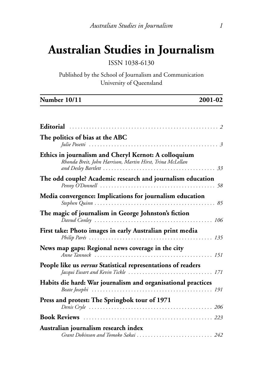
Scanned pages of Stephen Quinn's paper "Media convergence: Implications for journalism education" from Australian Studies in Journalism, 2001-02

Media Convergence and Journalism Education, 2002

This is Stephen Quinn’s paper “Media convergence: Implications for journalism education,” published in Australian Studies in Journalism, Number 10/11, 2001-02, from the School of Journalism and Communication at the University of Queensland. Quinn was then director of the Center for Media Training and Research at Zayed University in Dubai, and he surveys what was, at the time, the newest idea in the newspaper business: the notion that one reporter’s work should appear in print, on the Web, on radio and television, and eventually on a mobile phone.

The paper takes its starting point from the IFRA/WAN “Beyond the Printed Word” conference in Amsterdam in October 2000 — a gathering of nearly 500 senior newspaper managers from more than 40 countries. I was one of the two conference chairs, which is how I turn up in the text and in the references.

The other conference chairperson, Howard Finberg, pointed out the publishing industry’s strength was its staff, and these people would be “called on more and more in this multimedia, multi-task newsroom” (Finberg 2000).

The bibliography entry is a small pleasure to find in a scanned journal two decades later:

Finberg, Howard (2000), The Digital Futurist Consultancy <www.digitalfuturist.com>. [Finberg’s paper was “Classified: Cannibalism or growth impetus”.]

Much of the paper is case studies: the Tribune Company’s three models of “multiple-journalism” at the Chicago Tribune, the Orlando Sentinel and the Tampa Tribune, as described by IFRA’s Kerry Northrup; the Turun Sanomat operation in Finland; Ming Pao in Hong Kong; Singapore Press Holdings; and the Australian cross-media ownership debate. Quinn also gives space to the skeptics, including Walter Kiechel of the Harvard Business Review, who argued news was far more “medium-specific” than the convergence enthusiasts believed.

The section that has aged best is the one on education. Northrup frames the problem as a chicken-and-egg relationship between the schools and the industry:

“Do you train journalism students for the jobs that exist today so that when they graduate they can be employed? Or do you train people for the skills that they’re going to need in the news organisation tomorrow so that when the newspapers come along and say ‘we need a new generation of journalists’ they have people to pick from?”

And John Pavlik, then executive director of the Center for New Media at Columbia’s Graduate School of Journalism, argues that most American journalism programs were still organized along “early twentieth-century technological lines”:

“Rather than learning to be newspaper, magazine, television, radio or online reporters, they should simply be taught to be journalists working in a digital age” (Pavlik 1998).

Quinn’s conclusion is blunt — “Convergence is inevitable” — and his prescription is training, on the theory that news organizations would have to spend money teaching their own staffs, and that journalists would need to embrace what he calls lifelong learning.

That last point is why I’ve kept this one. The training gap described here is precisely the problem I spent the following decade working on at the Poynter Institute, building News University as a way to deliver journalism training online, affordably, to people who were never going to get to a week-long seminar in Reston or St. Petersburg. The industry’s appetite for paying for that training turned out to be a lot smaller than the industry’s appetite for talking about convergence.

Reading this in 2026, the vocabulary is what dates it. Nobody says “convergence” or “multiple-journalism” anymore, because the argument is over — every newsroom is multi-platform, every reporter shoots video, and the mobile phone Quinn treats as an emerging distribution channel is now the primary one. What did not get settled is the harder question underneath: who pays to teach people the work, and whether journalism schools train for the job that exists or the one that’s coming. Substitute “AI” for “XML” in these pages and the debate reads as current.

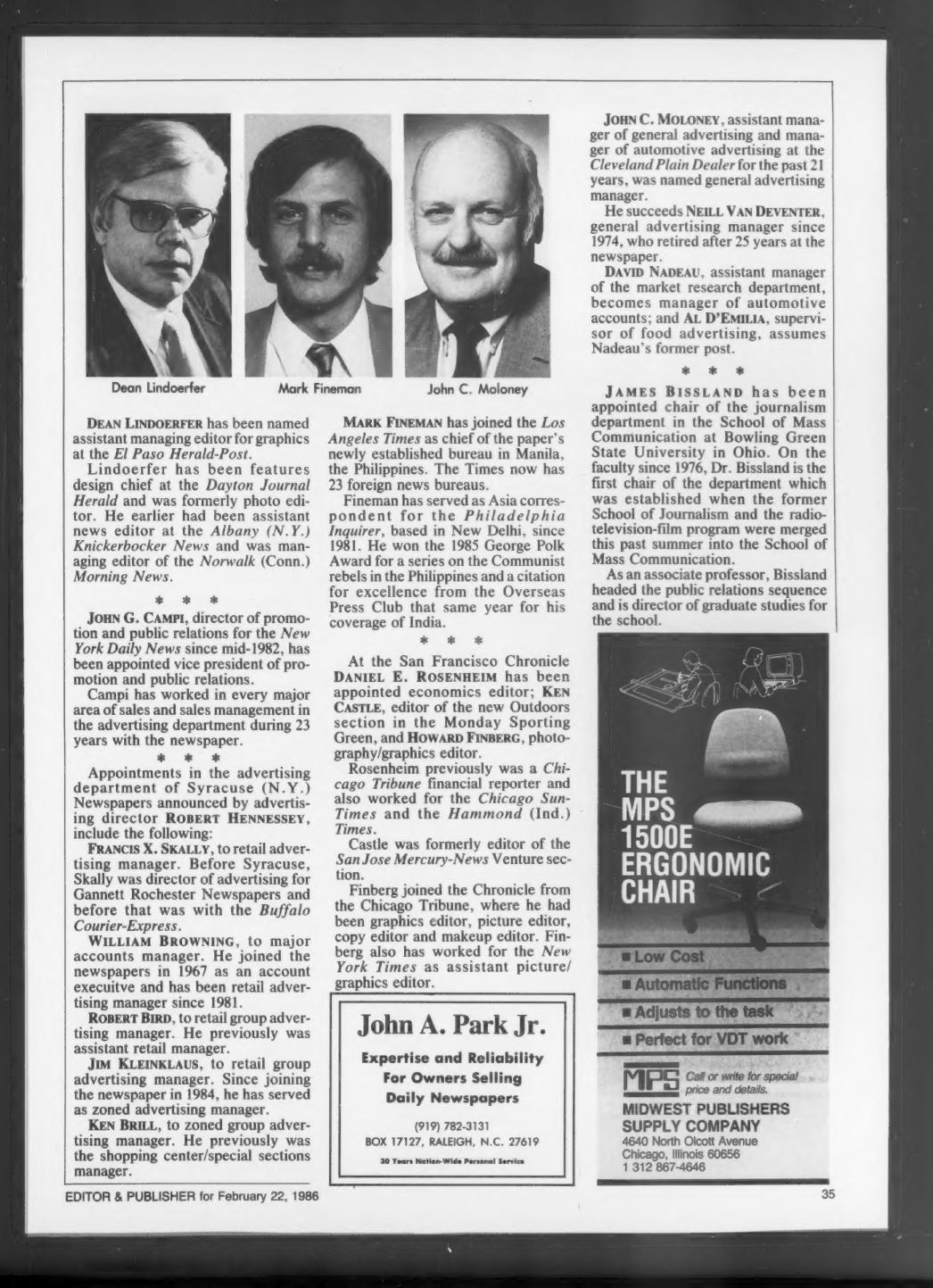
Editor & Publisher appointments column from Feb. 22, 1986, listing Howard Finberg as photography/graphics editor at the San Francisco Chronicle

E&P Notes My Move to San Francisco Chronicle

Before LinkedIn, before company press releases landed in your inbox, there was the back-of-the-book appointments column in Editor & Publisher. That’s where the industry found out who was moving where. This item, from the Feb. 22, 1986, issue, is where my arrival at the San Francisco Chronicle got recorded for the trade.

The Chronicle announced three appointments at once, and E&P ran them together in a single paragraph:

At the San Francisco Chronicle DANIEL E. ROSENHEIM has been appointed economics editor; KEN CASTLE, editor of the new Outdoors section in the Monday Sporting Green, and HOWARD FINBERG, photography/graphics editor.

Note the title: photography/graphics editor. The two responsibilities were bundled into one job, which tells you something about how newsrooms thought about visual journalism in the mid-1980s — pictures and graphics were still being sorted into the same drawer, even as informational graphics were becoming their own discipline. It also should be noted that I was the first person to hold this job at the paper.  Previously, the art and photo departments reported to other supervisors, such as the news editor.

The short biography that follows is a reasonable summary of the road that got me there:

Finberg joined the Chronicle from the Chicago Tribune, where he had been graphics editor, picture editor, copy editor and makeup editor. Finberg also has worked for the New York Times as assistant picture/graphics editor.

I’m also amused that Dan Rosenheim and I arrived at the Chronicle from the same place — he came from the Tribune’s financial staff. The Chicago-to-San Francisco pipeline was apparently running that year.

The rest of the page is a perfect artifact of the era: an assistant managing editor for graphics named at the El Paso Herald-Post, a promotion executive elevated at the New York Daily News, five advertising appointments at the Syracuse newspapers, the Los Angeles Times opening a Manila bureau (its 23rd foreign bureau), and a new journalism department chair at Bowling Green — all wrapped around display ads for a newspaper broker in Raleigh and a printing supply company in Chicago. That was the industry talking to itself, one column inch at a time.

My time at the Chronicle didn’t last long. The following year I left for Phoenix and The Arizona Republic, which announced my hiring as assistant managing editor for graphics in June 1987 — and identified me, naturally, as “Howard Finberg of the San Francisco Chronicle.”

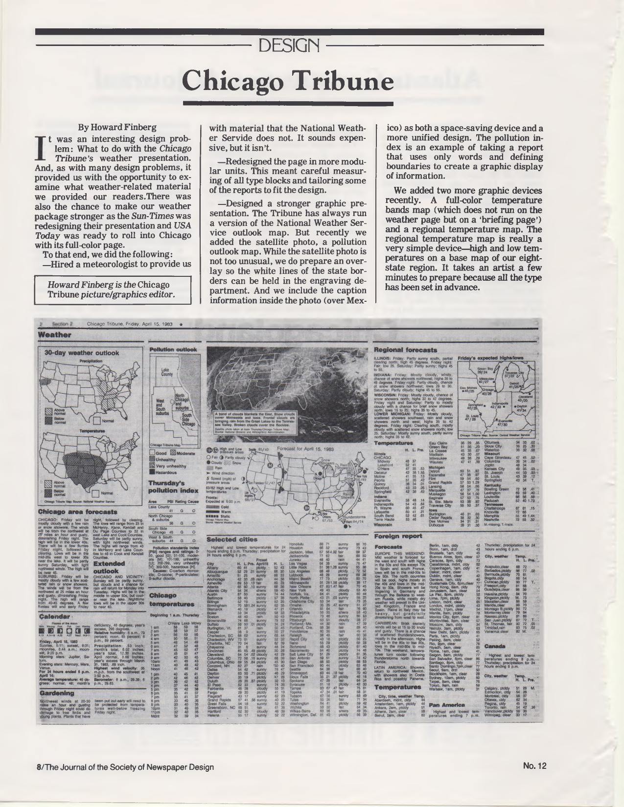
Chicago Tribune weather page from April 15, 1983, reproduced in the Society of Newspaper Design journal with outlook, satellite and temperature maps

Weather Page Design: Chicago Tribune and Atlanta

From The Journal of the Society of Newspaper Design, No. 12, a two-part look at newspaper weather packages. My piece describes the rethinking of the Chicago Tribune‘s weather presentation — done while the Sun-Times was redesigning its own weather page and USA Today was about to enter Chicago with a full-color version. The steps: hiring a meteorologist for material beyond what the National Weather Service supplied, rebuilding the page in modular units with carefully measured type blocks, and strengthening the graphics — the outlook map, a satellite photo with an engraving overlay to hold the white state borders, a pollution outlook map, a full-color temperature bands map on the briefing page, and a simple regional temperature map for the Tribune’s eight-state region. The example page reproduced with the article is dated Friday, April 15, 1983. At the time I was the Tribune’s picture/graphics editor.

The pollution index is an example of taking a report that uses only words and defining boundaries to create a graphic display of information.

It takes an artist a few minutes to prepare because all the type has been set in advance.

The facing article is by Joe Coleman, then photo editor of the Atlanta Journal & Constitution, on that paper’s half-page color weather map, developed as part of a redesign of the afternoon Journal. Coleman credits then-managing editor Eddie Sears:

Eddie Sears, had seen the USA Today prototype and found one thing worth stealing — an expanded weather map.

Coleman also describes adding columnist Charles Salter to personalize the data, and lists cautions for anyone building a weather package — designate a person responsible for gathering data, format as much as possible, and be careful about dropping cities:

We got more calls on dropping readers’ home towns or favorite foreign vacation spots than any other changes made over the past ten months.

An interesting twist: Joe Coleman is the same Joe Coleman I would later hire as my photo editor at The Arizona Republic in the late 1980s.

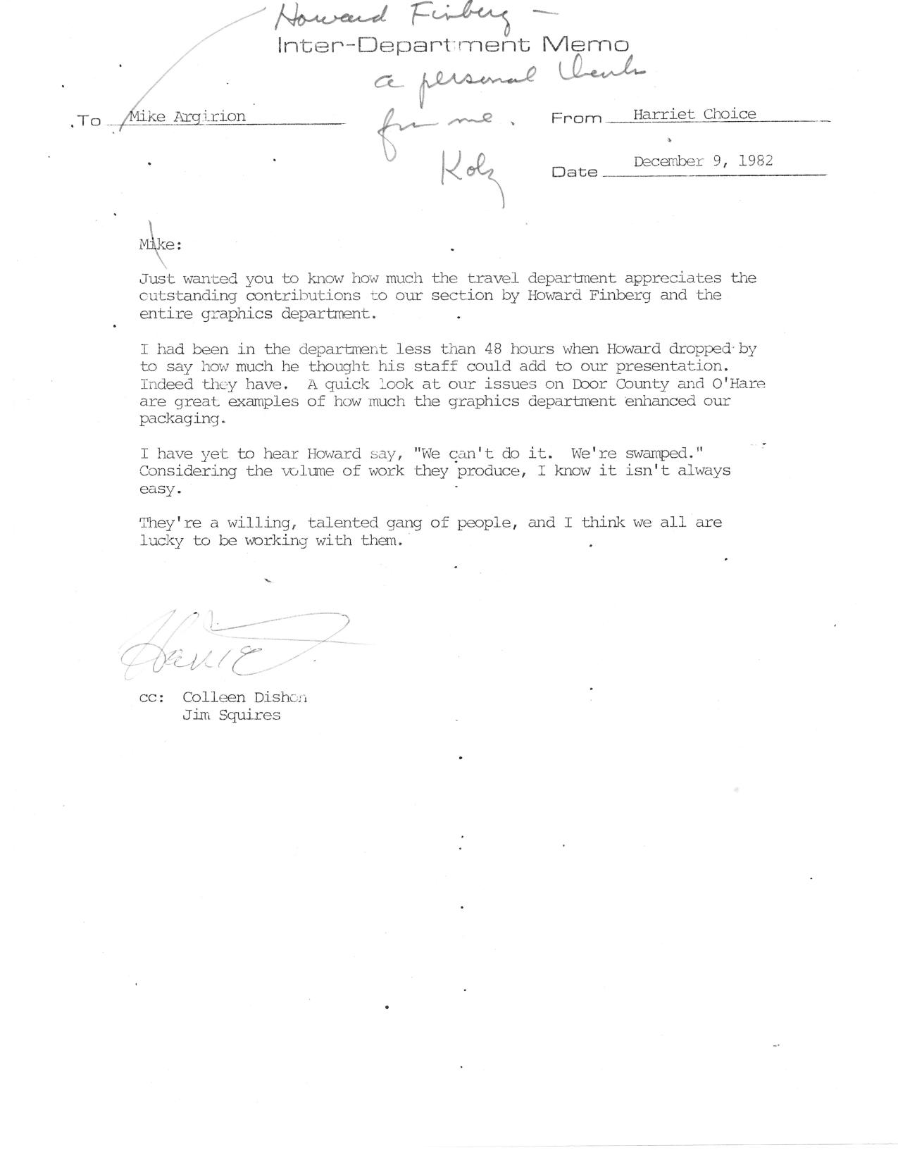
1982 Chicago Tribune inter-department memo from Harriet Choice thanking Howard Finberg and the graphics department

A Thank You Note From the Travel Department

An inter-department memo from the Chicago Tribune, dated December 9, 1982, from Harriet Choice to Mike Argirion, with copies to Colleen Dishon and Jim Squires. It’s a note of appreciation for the work the graphics department was doing for the travel section.

Just wanted you to know how much the travel department appreciates the outstanding contributions to our section by Howard Finberg and the entire graphics department.

She mentions two specific packages — the Door County and O’Hare issues — as examples of what the collaboration produced.

I had been in the department less than 48 hours when Howard dropped by to say how much he thought his staff could add to our presentation. Indeed they have.

My favorite line:

I have yet to hear Howard say, “We can’t do it. We’re swamped.” Considering the volume of work they produce, I know it isn’t always easy.

The credit belongs to the staff, not to me. As she put it:

They’re a willing, talented gang of people, and I think we all are lucky to be working with them.

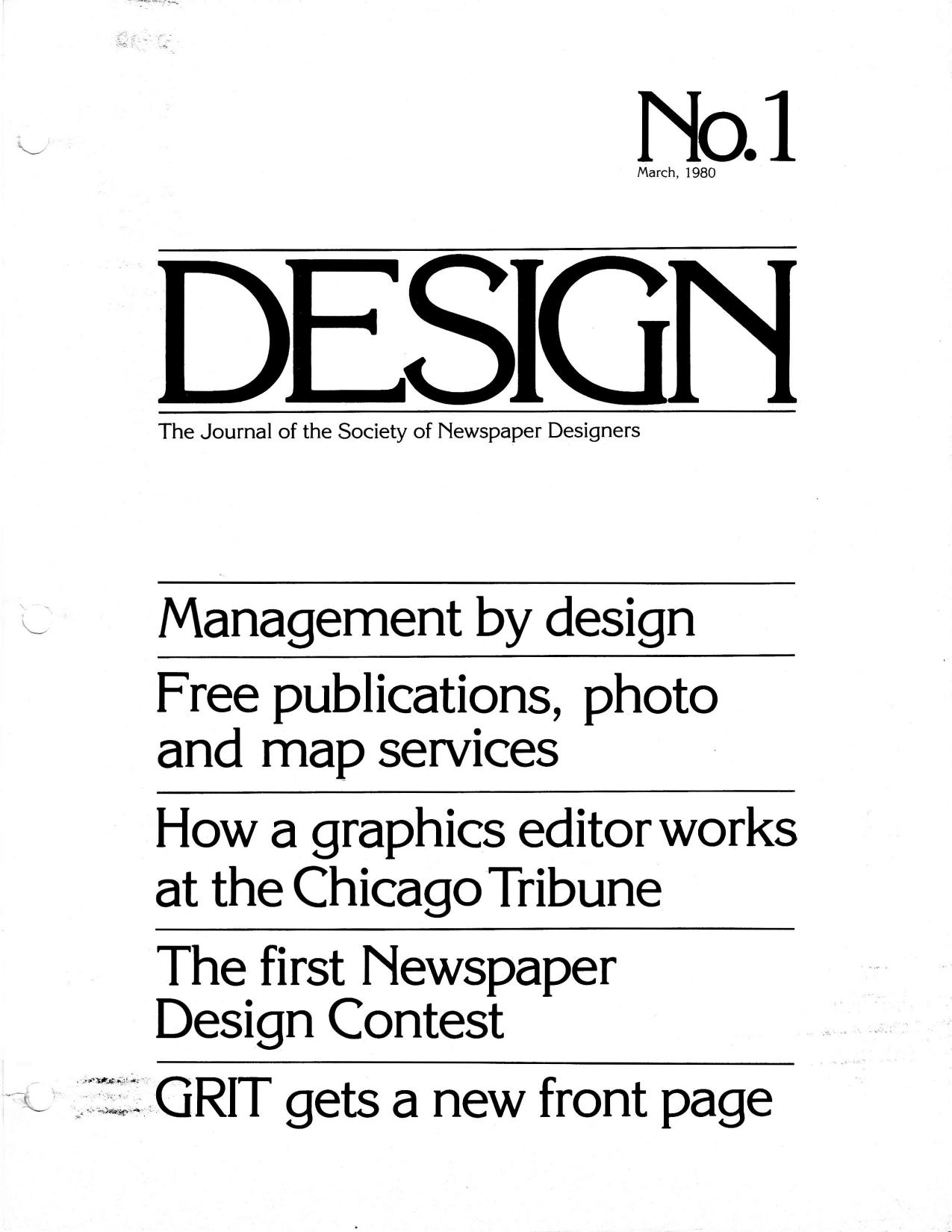
Cover of Design No. 1, March 1980, the Society of Newspaper Designers journal containing the "What is a graphics editor?" talk

“What Is a Graphics Editor?” — The First Issue of Design, March 1980

This is No. 1 of Design, the quarterly journal of the Society of Newspaper Designers, dated March 1, 1980 and edited by Richard Curtis, then assistant managing editor of The News American in Baltimore. The 32-page issue includes Louis Silverstein of The New York Times on design and content, Robert Lockwood’s essay on newspaper management by design, David B. Gray of the Providence Journal-Bulletin on the photo lab as a newsroom resource, Randy Miller’s report on the Kansas City Star/Times seminar, Ed Breen of the Marion (Ind.) Chronicle on words and pictures, a rundown of the Society’s first Newspaper Design Contest, and the redesign of GRIT’s front page.

Curtis used his editor’s note to explain where the organization came from — and how quickly it had grown.

The society was founded, rather informally, in 1978 in a bar in Reston, Virginia during the first American Press Institute seminar on newspaper design.

From a newsletter that went to all 12 members, the Society had reached more than 160 members, produced a videotape presentation called “News by Design,” and mounted its first workshop — held with the Chicago Tribune at the Hyatt Regency in Chicago on Sept. 28, 29 and 30, 1979, drawing nearly 150 participants from the United States, Canada and Costa Rica.

I have a byline in this issue, on a piece headlined “What is a graphics editor?” I didn’t write it. It is a transcription of the talk I gave at that first Chicago workshop, on Sept. 29, 1979, as graphics editor of the Chicago Tribune

My responsibilities at the Tribune are for all graphics that appear in the editorial pages. The question that often arises is, what’s a graphic? The way we define it is charts, maps, combinations… anything that is not what is described as pure illustration. In other words, if it has editorial matter — there are words with it — then it falls under the province of the graphic editor.

Much of the talk was about where the job sits in the newsroom — attending the two daily news meetings, reporting to the assistant managing editor, reading over a reporter’s shoulder before the story lands on the city desk. And about knowing when to say no:

Of course, there’s always one other function of the graphics editor that’s not as pleasant, and that’s knowing when to kill (a graphic). Because there’s nothing worse than a graphic that doesn’t work.

You can have the prettiest looking graphics in the paper and it doesn’t mean anything if it doesn’t communicate with readers.

The issue closes with a membership form ($20 a year, dues covering the magazine), a jobs listing, and a promise for No. 2: an issue built around the question the Kansas City seminar had put to editors — how do we do more with less? Forty-five years on, that’s still the question, and I would go on both to write for this magazine and to be written about in it.

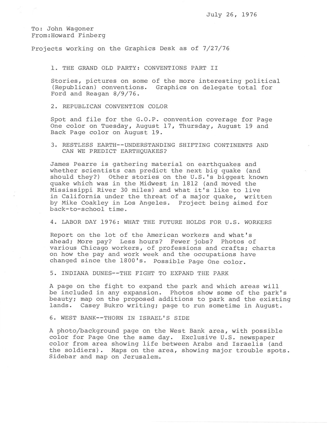
Typed July 1976 memo to Chicago Tribune news editor John Waggoner listing Graphics Desk projects in the works

Projects Working on the Graphics Desk, July 1976

A status memo I sent to John Waggoner, the Chicago Tribune‘s news editor, on July 26, 1976, listing what the Graphics Desk had in the works. It’s a snapshot of how an information graphics operation planned its projects — a mix of hard-news color coverage, explanatory packages, and long-lead background reports.

The list runs from the Republican convention (delegate totals for Ford and Reagan, Page One color on August 17 and 19) to a package on earthquakes aimed at back-to-school time:

Other stories on the U.S.’s biggest known quake which was in the Midwest in 1812 (and moved the Mississippi River 30 miles) and what it’s like to live in California under the threat of a major quake, written by Mike Coakley in Los Angeles.

Also on the schedule: a Labor Day report on American workers, with charts on how pay, the work week and occupations had changed since the 1800s; a page on the fight to expand the Indiana Dunes park, written by Casey Bukro; and a photo/background page on the West Bank, with maps of major trouble spots and a sidebar on Jerusalem.

The “other projects working” section is a reminder of what the mid-1970s looked like from a newsroom. The metric system:

Charts, tables, photos to make it easier on the reader who can’t tell a meter from a liter.

Plus solar energy (Bukro writing), “Weapons of the future” on Black Box technology (Jim Coates in Washington), and space after Viking, with the community turning its sights to the shuttle (Jim Pearre researching).

Copies went to Max McCrohon, Bill Jones, Joe Leonard, Denis Gosselin and Dick Leslie.

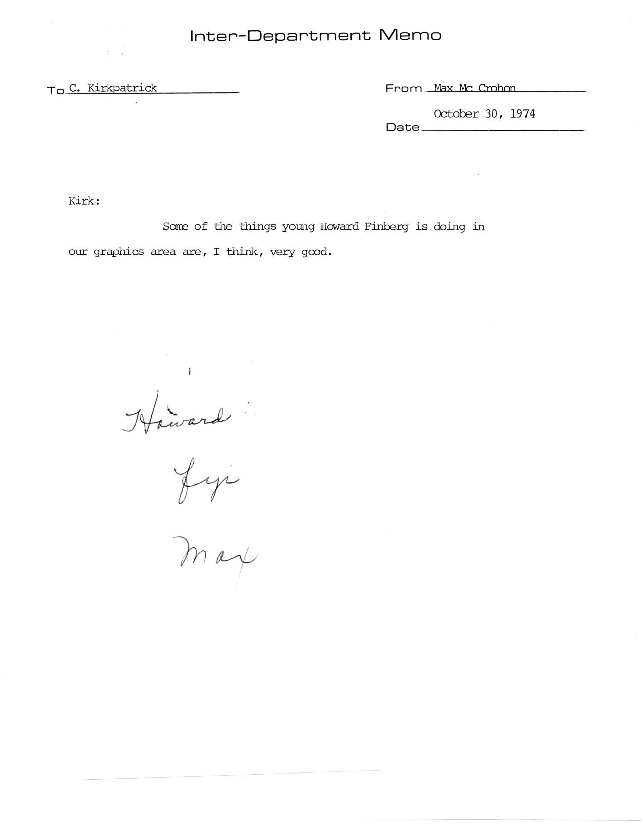
Chicago Tribune Inter-Department Memo dated October 30, 1974, from Max McCrohon praising Howard Finberg's work in the graphics area

A Short Note About Graphics

This is about as short as a memo can get, and it is a favorite document in the collection. Written on a Chicago Tribune Inter-Department Memo form, dated October 30, 1974, from Max McCrohon to C. Kirkpatrick. Two lines. That’s it.

Some of the things young Howard Finberg is doing in our graphics area are, I think, very good.

I was in the Tribune’s graphics area at the time, and “young” was accurate. Actually, I was the only graphics person at the paper. Getting noticed by the managing editor mattered, and getting it in writing mattered more — which is presumably why I kept a copy for the next fifty years. It was McCrohon who created the graphics editor job and put me in it.

What strikes me now is how much of a career can start with a sentence like this. Nothing in the memo says what those “things” were. But information graphics at newspapers were still being invented in the mid-1970s, and someone above me was paying attention.

Typewritten 1974 Chicago Tribune staff report titled Proposals for Improving the Chicago Tribune and Attracting Younger Readers

Attracting Younger Readers: 1974 Tribune Report

This is a staff report from my early days at the Chicago Tribune, titled “Proposals for Improving the Chicago Tribune and Attracting Younger Readers.” It carries the names of nine staffers: Ovie Carter, Gary Deeb, Howard Finberg, Clarence Page, Don Pierson, Bill Plunkett, Schickedanz, Rick Soll and Linda Winer. We were tasked to help the Tribune reach younger readers.  We were the younger staff members; I had been at the Trib for just about 2 years.

The introduction doesn’t ease into the problem. It opens with a description of how the paper was being seen from the outside:

Big, bulky. Impersonal. Stodgy. More concerned with things than people. As much fun as drinking cod liver oil (good for you but not so easy to swallow). Nearly devoid of any flair, flamboyance, or personality.

The committee’s argument was that this was a problem of perception and image more than content, and that the attitudes outside the building were mirrored by the attitudes inside it.

Simply stated, the Chicago Tribune takes itself too seriously. This is not to diminish its role as one of the nation’s best newspapers. Rather, it is a suggestion that the time has come for the Chicago Tribune to slaughter, once and for all, many of its sacred cows.

From there the report goes section by section — main news, editorial page, Perspective, Tempo, sports, business, the picture page, comics, Metro, the Sunday paper, copy editing, promotion. The recommendations are specific and, in places, blunt. A page one index every day. Long stories jumped to a designated jump page. A news-feature editor responsible for Column 1 and other offbeat material. Tempo remade from an old-fashioned women’s section into a daily “magazine-of-life,” preferably as an easy-to-handle tabloid pullout for the bus or train commuter. Entertainment and the arts displayed prominently rather than buried. A pop-culture column three times a week. Business pulled out as its own section. Sports writing tightened, with irreverence and humor encouraged.

The masthead got its own recommendation:

Removal of the flag would not necessarily attract new readership by itself. However, the slogan “World’s Greatest Newspaper” should be dumped. Its hyperbolic nature is unsuitable for the Tribune’s newly acclaimed progressive attitude of fairness and credibility.

The editorial page came in for the harshest treatment — described as the single most offensive part of the paper to young readers, with editorials characterized as “prairie populism” and “jumping jingoism.” The committee acknowledged that asking the paper to moderate its editorial stance might be impractical, then added a line I still like:

Editorial writers are advised that it is not always necessary to stand athwart progress hollering “Halt!”

What holds up best, reading it now, are the sections on people rather than packaging. The report faulted the paper for poor use of staff — writers forced to write formula stories, individual voices absorbed into what the report called “the Grey Blob,” and very little discussion between writers and editors about the quality of work. It also pressed on coverage of women and on Black and Latin communities, noting that most coverage of those communities “still consists of crime news, special series, and Operation PUSH,” and calling for the paper’s shortcomings there to be thoroughly investigated.

The closing borrowed the paper’s own advertising line:

To paraphrase the Trib’s current ad-promo line, “We need a friend in the Tribune.”

Fifty-plus years later, the questions in this report — how does a newspaper reach readers who don’t already have the habit, and how does it let its own staff sound like human beings — have never really gone away. Only the platforms changed.