Mario Garcia on The Arizona Republic Redesign
The Arizona Republic’s redesign was an interesting exercise in trying to find a way to please a publisher who had the dream of making The Republic a New York Times-style newspaper. That meant he wanted a subdued approach to headlines and design and NO color. Putting it in positive terms: classic design.
When the publisher of The Arizona Republic, Pat Murphy, commissioned me to redesign his newspaper, he had brought to our discussion a clearly defined blueprint of what he wanted his newspaper to look like: “Make it elegant,” he said. “Also let it look like a classic, reliable newspaper, one that readers will feel comfortable and safe with.”
Truthfully, I hated it. Mario Garcia didn’t care for it either. He was very kind in an article he wrote for Newspaper Techniques, the monthly newsletter of IFRA. He was also said some very kind things about me.
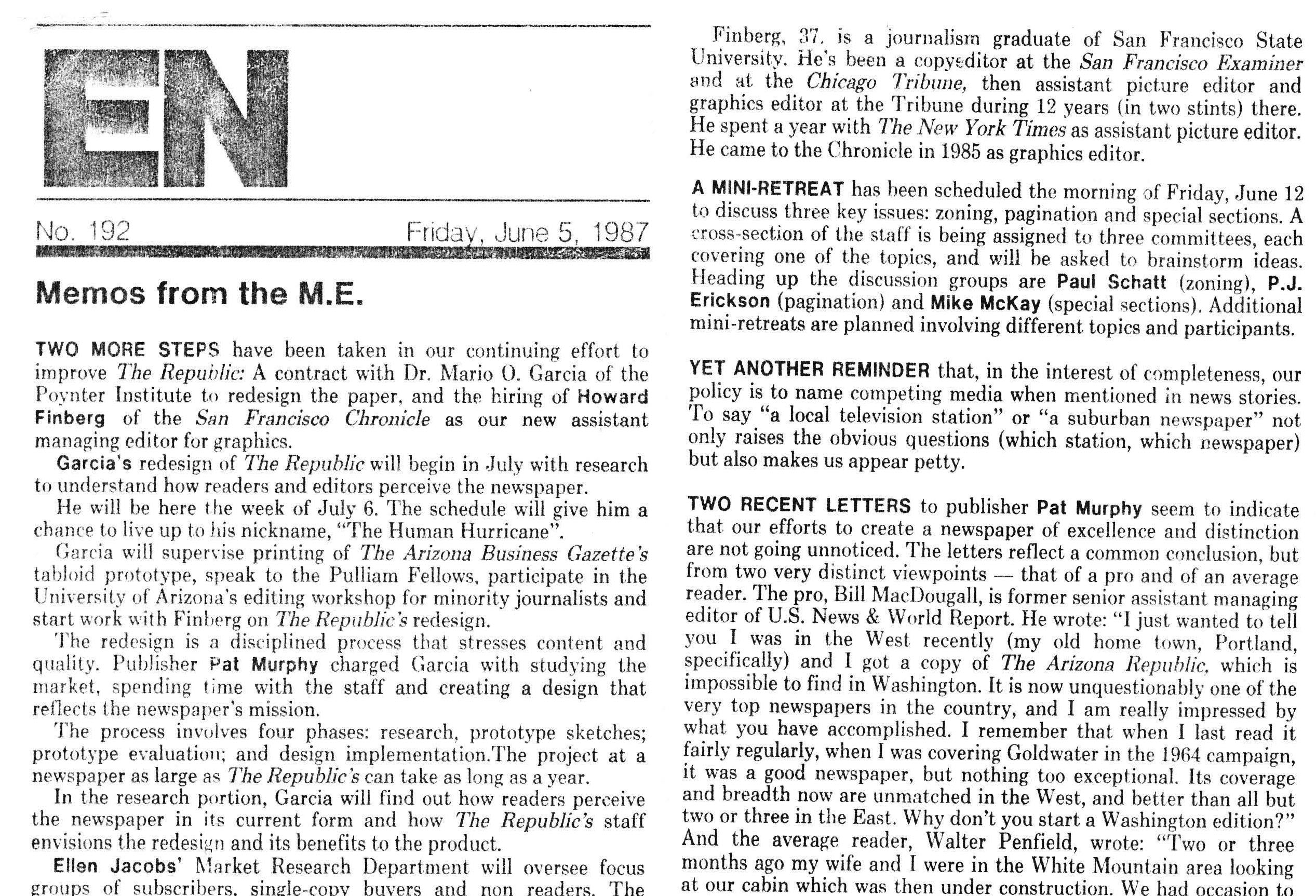
The Arizona Republic, is totally paginated (triple-I), which facilitated the idea of a half-column concept. Into the third month of the redesign, the newspaper hired an assistant managing editor for graphics, Howard Finberg, who came from The San Francisco Chronicle, and had served as graphics editor of The Chicago Tribune, as well. With his impressive credentials and experience, he became a full partner in the process, refining the use of informational graphics, guiding the every day logistics of the redesign, and hiring new designers for the different sections.